
A polished product page can still leave a shopper with no reason to move.
A visitor may admire the clean photos, skim a glowing paragraph, and still pause at the one question that matters: is this the right product for this situation? If the page never answers it, the affiliate link feels like a leap rather than a useful next step.
The strongest recommendation pages do not try to corner anyone into clicking. They make the decision easier: identify who the item suits, where it falls short, what distinguishes it from nearby alternatives, and what to expect after the retailer page opens. A click is usually the result of resolved uncertainty, not louder persuasion.
- A clear fit: the task, user, or budget the product serves best.
- One honest limitation, which makes the recommendation more believable.
Choose the click before the layout
Before arranging comparison tables, buttons, or product images, decide what the visitor is trying to accomplish. A page built for a reader who wants a quick price check should feel very different from one built for someone choosing between three beginner-friendly tools.
Write one plain-language intent statement, such as: “Help a first-time camper pick a compact stove for weekend trips.” Then name one primary affiliate destination: the retailer or product page most likely to satisfy that need. Every major module should support that single click.
Useful intent-to-layout matches include:
- Ready to buy: price context, stock notes, a short verdict, and a prominent outbound button.
- Comparing options: a compact comparison table, clear trade-offs, then one recommended choice.
- Still researching: buying criteria, practical examples, and softer links to suitable products.
This is a content and layout decision, not the same as creating an External/Affiliate product in WooCommerce. The technical product type handles fields such as the outbound URL and button text; the page structure decides why that button deserves attention. For the wider WooCommerce affiliate store setup, those settings come after the destination and visitor goal are clear.
Build a short path from question to retailer
-
Open with the search problem
Name the situation that brought the visitor in: a cramped balcony, a first espresso setup, or a need for quieter headphones. A headline and two-line intro should confirm the page answers that exact question, not merely display a product.
-
State the recommendation early
Place the product name, a plain-language verdict, and the best-fit buyer near the top. Include one meaningful limitation here too; it prevents the recommendation from reading like copied merchant copy.
-
Show the reasons behind the choice
Use a small set of benefits tied to the original problem. For example, explain how a compact air fryer saves counter space, then note its basket size rather than listing every manufacturer specification.
-
Add proof where doubt appears
Photos, a brief hands-on observation, relevant review patterns, dimensions, compatibility details, or a comparison table can answer the objection most likely to stop a click. Cite sources and avoid claims that cannot be checked.
-
Make the external action unmistakable
Put a retailer button after the key evidence and repeat it only after a substantial section, such as comparisons or FAQs. Label it with the destination and outcome—“Check current price at [Retailer]”—so the visitor knows the next page is external.
Remove any block that does not answer a buying question or make the retailer click easier to judge.
Make the first screen do the selling
The opening screen should let a visitor answer five questions without scrolling: What is this? Who is it for? Why might it suit this situation? What does it cost today? Where does the link go?
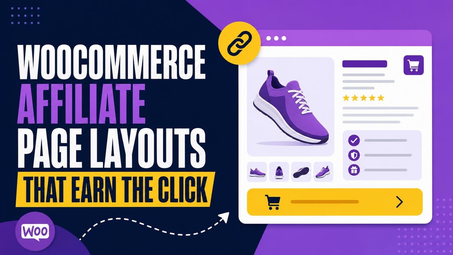
Start with a plain-language positioning line beside a useful product image. Avoid a generic packshot when an image can show scale, use, or a meaningful feature. For example: “A compact 20L daypack for short hikes and city carry, with room for a light rain layer and lunch.”
Write the short description from hands-on research, product specifications, and the page’s chosen intent—not the manufacturer’s copy. Name one strength and one practical limit. “Its padded laptop sleeve is useful for commuting, but the narrow side pockets may not hold larger bottles” is more helpful than “built for every adventure.”
Show a price only when it can be kept current. Use “Price at retailer” or “From $49” when the retailer page is the dependable source, and avoid presenting stale comparison prices as a deal. Place a visible “Check price at [Retailer]” button near that context, with an external-link indicator if the design uses one.
Keep the affiliate disclosure close to the button in readable text: “This link may earn a commission at no extra cost.” It should clarify the relationship, not interrupt the decision.
If the product’s audience, main trade-off, retailer destination, and affiliate relationship are not obvious in a few seconds, simplify the opening rather than adding more copy.
Put the details where hesitation happens
Long-form copy earns its space when it resolves a specific doubt. Instead of a single wall of description, group information by the decision it supports: why it helps, what it cannot do, whether it fits, and what daily use feels like. Readers can then jump to the part that matters to them.
Start with benefits, then qualify them
Lead with two or three concrete outcomes, such as easier storage, quieter operation, or less cleanup. Follow each claim with a limit that prevents an unpleasant surprise. A compact blender, for example, may suit one-person smoothies but struggle with frozen ingredients unless liquid is added first.
Make facts easy to compare
Use a short table for specifications that affect suitability.
| Check | Why it matters |
|---|---|
| Dimensions and weight | Confirms shelf, desk, or travel fit |
| Power, capacity, or material | Indicates realistic performance |
| Included parts | Avoids accessory assumptions |
| Compatibility | Confirms it works with existing gear |
A separate Compatibility section is especially useful for adapters, cases, replacement parts, software, and ecosystem-specific products. State known model ranges plainly, and link to the retailer for the current compatibility list when details change often.
Add real-use context
Brief scenarios make specifications meaningful: who benefits, where the item works best, and who should consider another option. A “Good fit for” and “Skip it if” pair can be faster to absorb than another paragraph.
Not every visitor reads in order. Some arrive ready to compare destinations, so place relevant guidance about product boxes and text links near comparison content, while keeping the primary retailer button available after major sections.
Make the recommendation easy to verify
A recommendation becomes more credible when its claims can be checked without leaving readers to guess. Place a short “Why this pick” note near the verdict: for example, “Chosen for its compact size, strong beginner controls, and current availability under $100.” That explains the selection standard, not merely the product’s appeal.
Link factual claims to the best available source. Manufacturer pages suit dimensions, compatibility, and warranty terms; retailer listings help confirm live price and stock. Add a visible last checked date beside any price-sensitive information, and update it when the page is reviewed.
Disclosure need not interrupt the decision. A plain line near the first retailer button works well: “This page contains affiliate links; a commission may be earned at no extra cost.” It should be readable, not buried in a footer.
Include one or two meaningful limitations. A small camera may travel well but offer fewer controls; a low-cost tool may lack a case or replacement parts. The right drawback helps the unsuitable visitor choose an alternative—and makes the positive recommendation more believable.
Time the retailer link for confidence
A retailer button works best immediately after a visitor has enough information to make a small decision. That moment may come after the opening fit summary for a simple recommendation, after a comparison table for a technical item, or after the limitations section for a higher-priced product. Repeating the same action before those milestones creates visual noise rather than urgency.
Match the label to what happens next
Set expectations in the button itself. “Check price at Retailer” is more honest than “Buy now” when stock, shipping, final price, and checkout all happen elsewhere. For a choice-led page, labels such as “See colors at Retailer” or “Compare current options” explain why the click is useful.
Keep the affiliate disclosure nearby, but do not make it compete with the action. A brief line beneath the button—“External retailer link; a commission may be earned”—is usually enough when the full disclosure is already visible earlier on the page.
Keep every outbound route familiar
Use one recognizable outbound-button style across product pages: the same color, icon treatment, label pattern, and external-link behavior. A visitor should not need to guess whether a highlighted element opens a retailer, expands an accordion, or adds an item to a local cart. Stores that need more control can refine outbound CTA buttons with a plugin, but consistency matters more than extra effects.
If a page offers an alternative product, give it a quieter text link or secondary button. The primary retailer action should remain the clearest route for the recommendation being presented.
Before publishing, check each outbound label against its destination. If it says “Check price,” it should open the relevant product page—not a generic category, search result, or unexpected popup.
Keep the path short after publishing
- Test the retailer button on a phone, including its label, destination, and return path.
- Record outbound CTA clicks before changing the layout.
- Change one meaningful element—such as CTA placement or the comparison block—then compare results.
Choose one existing product page today and remove one element that delays the retailer click. Then check the page on a phone from first screen to outbound link, and note the current CTA click rate. Small, isolated tests make it easier to spot what genuinely helps readers act.








25 responses to “How to Create WooCommerce Affiliate Product Page Layouts That Earn the Click”
The “source key claims” advice sounds good in theory, but manufacturer spec sheets aren’t always accurate either. For products where comfort or battery life varies wildly, are you treating review testing as a source, or only hard specs?
I worry that citing everything can turn a useful page into homework.
Use the source that matches the claim. Manufacturer documentation is appropriate for dimensions, compatibility, and warranty terms; firsthand testing or credible independent reviews can support experience-based claims. The page does not need a bibliography—brief source links or notes near high-stakes claims are usually enough.
Exactly. I cite the official manual for supported devices, then phrase comfort as “better for…” rather than pretending it is universal fact.
Really useful checklist. The alternate route for comparison-minded readers is the bit I had missed—I kept stuffing every alternative into the main recommendation instead of giving people a clean “compare similar options” path.
I tested the first-screen advice this week on a hiking backpack roundup. Version A opened with brand background; Version B opened with who it fits, one limitation, and a “See current price at REI” button. B got fewer random clicks but more completed retailer sessions according to the network report.
Quality over button mashing, apparently 🙂
Excellent result. Fewer accidental or low-intent clicks can be a win when the page sets expectations properly. Your fit-plus-limitation combination likely filtered readers before they left the site.
This is what I needed to hear. I was treating outbound CTR as the only number that mattered, which encourages some pretty dumb CTA placement.
This worked for me on a coffee grinder page. I moved the retailer button below a short “best for small kitchens” section instead of putting it beside the title, and outbound clicks went up without adding more buttons.
Also added the price-check date like you suggested. Such a small trust signal.
That is a great example of timing the link after the relevant decision point. For a compact grinder, kitchen space is often the real question, so answering it before the retailer action makes the click more intentional.
Same here. “Best for small kitchens” is way more useful than another vague “premium quality” line.
The limitation language is refreshing. I bought a “best overall” recommendation once that quietly required a subscription after 30 days. That detail should have been in the first screen, not tucked beneath 14 paragraphs of cheerleading.
I appreciate the pushback on visual polish. So many affiliate templates look like a casino landing page with six orange buttons before I’ve even learned what the thing does. Clear trade-offs are a much better conversion tool than fake urgency.
Step 3—the short path from question to retailer—didn’t quite work for me. My product needs a size guide, compatibility note, and a couple of alternatives before people feel ready. If I shorten it too much, it feels like I’m hiding the catches.
You do not need to remove fit-critical information. “Short” means no unnecessary detours: keep the size guide and compatibility note in the main path if they determine whether the product works, then place alternatives in a clearly labeled comparison route.
I had that issue with camera accessories. A tiny compatibility table near the button did more than a long specs section buried at the bottom.
The nearby disclosure point is important. I used to have one generic affiliate disclosure in the footer because a theme demo told me that was enough. It may technically count, but it definitely doesn’t help readers understand why a retailer link is there.
Question about price context: if the retailer price changes constantly, do you show a number at all? I don’t want stale pricing, but “check current price” alone seems a little evasive.
Use a price only when you can keep it reliably updated. Otherwise, a truthful range or context such as “usually positioned below comparable models,” paired with “check current price at Retailer,” can be better. If you publish a number, add the date checked and avoid wording that implies it is guaranteed.
I use “price checked May 2025” under mine. It cut down on the annoyed emails when a sale ended.
I changed my buttons from “Buy Now” to “View at Walmart” and added “affiliate link” beside the first one. No dramatic overnight miracle, but comments from readers became noticeably less suspicious. Clear labeling feels less salesy than trying to disguise the exit.
The reminder to choose the click before designing the page was exactly what I needed. I keep trying to make every product page serve beginners, bargain hunters, and comparison shoppers at once, then wonder why nobody clicks.
I’m mildly skeptical of the one-change test recommendation. Traffic is noisy, seasons happen, retailer stock disappears… changing one CTA label and declaring victory after a week feels like analytics cosplay.
That said, I do like the mobile click-path check. I found a sticky cookie banner covering my only useful button. Very elegant. Very 2024.
That skepticism is warranted. A one-change test should run long enough to collect meaningful traffic and should be interpreted alongside seasonality, stock status, and page rankings. The point is to avoid changing headline, layout, links, and copy all at once—not to claim certainty from a tiny sample.
“Analytics cosplay” is painfully accurate. I keep a change log now, including whether the retailer was out of stock, because that can wreck a test overnight.
A change log is an excellent habit. Recording retailer availability and promotion periods makes later results much easier to interpret, especially when affiliate data arrives with limited context.