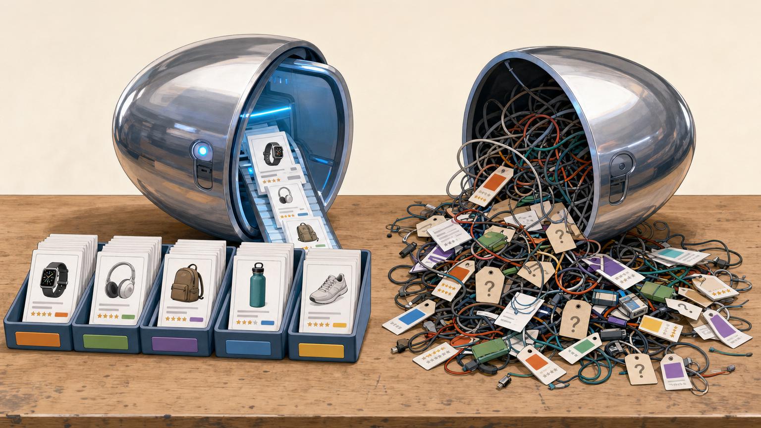

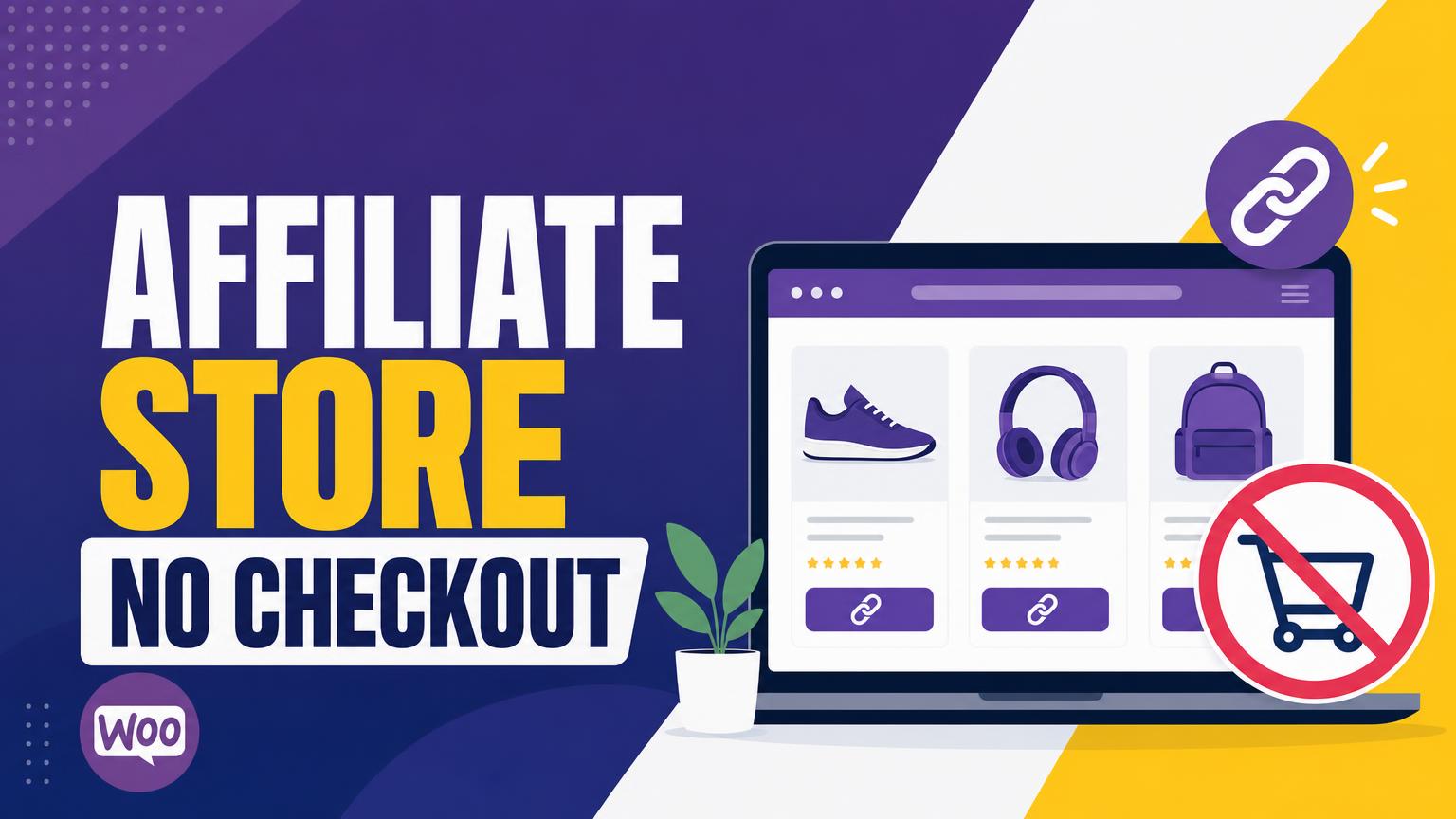
A store-like catalog can recommend products without pretending to sell them.
A visitor lands on a tidy product page, compares a few options, and sees a familiar WooCommerce layout. The awkward moment comes when the page shows Add to cart, a price that looks final, or a checkout link—signals that payment will happen on this site.
An affiliate catalog should make a different promise. Product pages can still offer photos, descriptions, comparison details, and honest notes about who each item suits. But the action at the end needs to be unmistakable: a button such as “View at Retailer” or “Check price at [Store]” sends the visitor to the merchant’s site to purchase. No local basket, no account creation, and no checkout path means fewer crossed wires.
Clear wording matters more than clever design. A short disclosure near the button can explain that the link leads to a retailer and may earn a commission. The result feels like a helpful shortlist rather than a shop that stops working at the last step.
- “View at Retailer” makes the destination clear before the click.
- Avoid “Buy now” unless the linked retailer and handoff are stated beside it.
WooCommerce can be the catalog, not the seller
Catalog layer
WooCommerce gives each recommendation a proper product page: photos, a short description, categories, and filters. It behaves like a browsable storefront even though no order is taken there.
External/Affiliate product
This built-in product type replaces the normal Add to cart action with a button that opens a retailer or partner link. The button can say “View at retailer” or “Check price,” making the handoff clear.
Merchant of record
The outside retailer handles the sale. Its checkout, payment methods, taxes, stock status, and order confirmation apply—not the WordPress site’s.
Fulfillment and support
Shipping, returns, damaged items, and customer service belong to the retailer that receives the order. The affiliate site can still help readers find products, but it should not imply that it can manage purchases.
Referral link
The external product URL is the destination link, often containing an affiliate tracking ID. It should lead directly to the matching item rather than a retailer’s general homepage.
The page may look like a shop listing, but the final button should make the next step obvious. No cart, checkout, customer accounts, or local order emails are needed when every purchase happens with another merchant.
A clear button label and a brief affiliate disclosure near the link help set the right expectation: this site recommends the item; the retailer sells and delivers it.
Build a catalog readers can trust
A useful affiliate store usually starts with a specific buying problem, not a broad product department. “Compact camping gear for weekend hikers” is easier to curate than “outdoor equipment.” A tighter focus makes comparisons clearer and reduces the temptation to add loosely related products simply to fill pages.
Choose merchants that look credible before importing dozens of products. Helpful signals include clear shipping and return information, current product pages, recognizable customer support details, and an affiliate program with documented rules. It is sensible to begin with a small group of retailers rather than rely on one source—or scatter links across many unfamiliar ones.
Keep tracking links under control. Record the merchant, program, destination URL, tracking ID, and date checked in a simple spreadsheet. Where an affiliate network permits it, use the approved deep link to the exact product page rather than a generic homepage. Link-cloaking tools should only be used when the program’s terms allow them.
Keep a few working assets
Before publishing at scale, prepare:
- a plain affiliate disclosure near recommendations;
- a contact page and basic privacy policy;
- a process for checking broken links and unavailable items;
- original notes explaining why each product earned a place.
Prices, stock, commissions, shipping policies, and affiliate terms can change without notice. Product claims should be dated, linked to the merchant where possible, and presented as current information rather than a promise.
A retailer may restrict paid ads, email promotion, price displays, coupon language, or redirected tracking links. The affiliate dashboard and program agreement are the source of record; a listing that worked last month may need updating today.
Publish an external product that clearly leads away
-
Create the product and choose External/Affiliate
In Products → Add New, enter a plain product name, a useful description, and a representative image. Under Product data, select External/Affiliate product; this removes the local cart behavior for that item.
-
Add the retailer’s destination URL
Paste the direct product-page link into Product URL, not a retailer homepage or search result. If an affiliate network supplies a tracked link, use that exact link and keep a copy in the link record.
-
Write a button that tells the truth
Replace the default button label with wording such as Check price at REI or See it at Bookshop.org. Naming the retailer makes the handoff obvious before a visitor leaves the site; avoid labels such as “Buy now” when the store does not sell the item.
-
Set display details without implying a local sale
Add a price only when it is checked and likely to stay current; otherwise, omit it or describe it as a reference price. Use the short description for a concise reason the item is recommended, plus an affiliate disclosure where it will be noticed.
-
Preview the listing and test the outbound button
View the product as a visitor, then click the button on desktop and mobile. Confirm that it reaches the intended item, shows the named retailer, and does not produce a warning, expired offer, or unrelated variant.
Products with sizes, colors, or other choices need special attention: external-product variation setups can fail in surprising ways. A single outbound URL cannot reliably carry every WooCommerce variation to the matching retailer option, so a simple product or separate listings is often safer.
Test the link after publishing, not only while editing. Affiliate redirects can change, and a link that reaches the retailer’s homepage is not enough.
If the retailer, item, or availability no longer matches the listing, update it promptly or unpublish the product. An honest button and a clearly named merchant do more for trust than a polished product card.
Remove the last buying signals
A catalog can still feel like a shop if its header includes Cart, Checkout, or My Account. A visitor who reaches an empty cart may wonder whether the retailer link failed, whether payment is unsafe, or whether the site is unfinished. Remove those choices from navigation, footer menus, and sidebar widgets.
Use the steps for disabling WooCommerce cart and checkout to block the remaining purchase pages and redirects. Also check for less obvious leftovers:
- Cart, checkout, account, and order-tracking links in menus
- Cart icons, mini-cart blocks, and “free shipping” notices
- Coupon prompts, payment badges, and “continue shopping” buttons
- Search results or old pages that still point to
/cart/or/checkout/
After changes are saved, open the site in a private browser window and follow a product button through to the merchant. The only buying action on the site should be the outgoing retailer link.
This is more than visual tidying. If someone later adds a standard WooCommerce product by mistake, active cart and checkout pages can turn that error into a misleading local order attempt. Keeping those routes disabled makes the problem obvious during testing and reduces cleanup later.
Cart and checkout pages may be hidden or redirected, but external product pages should remain public. They provide the recommendation, disclosure, and retailer button that visitors need before leaving the site.
Make each product page useful
A thin product description followed by “Buy now” gives readers little reason to trust the link. Each page should explain why this item made the shortlist: a practical use, a notable strength, and the kind of shopper it suits. A simple product-page structure that leads naturally to the retailer keeps that case easy to scan.
Include the details that affect a decision, rather than copying every manufacturer field:
- Key specifications: size, compatibility, materials, power source, or included parts.
- Best fit: for example, occasional camping, a small desk, or beginners on a modest budget.
- Limits: missing accessories, a bulky design, or a feature that may be unnecessary for some buyers.
- Price context: state the last checked price or a realistic range, and note that retailer pricing can change.
Original observations can stay modest. “The compact size may suit apartment storage” is more helpful—and safer—than claiming hands-on testing that did not happen. The outbound button should then name the destination, such as Check current price at Retailer.
Turn isolated picks into a browseable catalog
Good pages still need clear paths between them. Group related products by a decision readers already make: under a budget, for beginners, lightweight options, or the best choice for a particular task. A curated collection page for related affiliate picks can introduce the comparison and link to the fuller recommendations.
Keep browsing comfortable on a phone. Use a short top menu, obvious category names, and filters only when the catalog is large enough to justify them. Useful filters include price band, product type, size, and intended use; vague filters such as “premium” often create more uncertainty.
Before settling on the storefront design, check how affiliate-friendly themes handle product browsing on a small screen. Collection cards should show an image, a plain product name, one defining detail, and a visible path to the review. This helps visitors compare first, then leave for the retailer with confidence.

Make the retailer handoff trustworthy
A visitor should never have to guess why a button opens another store. Place a plain-language affiliate disclosure near the first recommendation or purchase button, not only on a distant legal page. For example: “This site may earn a commission if a purchase is made through these links, at no extra cost to the buyer.”
Keep descriptions tied to information that can be supported. A product can be called compact when its dimensions show that; it should not be called “the best” or promise performance that has not been tested. Prices and stock change quickly, so use wording such as “price checked on [date]” or “see the retailer for current price.”
Name the destination where it helps confidence: “Check current availability at REI” is clearer than “Buy now.” The merchant name should match the actual landing page. If a tracking link redirects through a network, test that it still ends at the named retailer.
Run one last handoff test
Before launch, open several product pages on a desktop browser and a phone. Check that:
- each disclosure is visible before or alongside outbound buttons;
- the button label identifies an external retailer;
- every link reaches the intended product, not a generic search page or error;
- product name, main claim, and merchant remain consistent after the click;
- no cart, checkout, or account prompt appears on the affiliate site.
Repeat the check periodically, especially after bulk imports, retailer promotions, or plugin updates.
Use a private or incognito window on both desktop and mobile. This avoids a saved retailer login, cookie, or cached redirect hiding a broken handoff. Record failed links in the same sheet used to track products, merchants, and last-check dates.
Keep the setup simple until it cannot cope
When is an external-button plugin worth adding?
The built-in External/Affiliate product type is enough for a small catalog with one destination per item. Consider a dedicated external-button tool only when several button styles, merchants, tracking rules, or link displays become tedious to manage by hand.
Does a mixed store need a separate site?
Not necessarily, but affiliate recommendations and locally sold items must look and behave differently. A clear approach to combining retailer links with own products prevents visitors from expecting one checkout process everywhere.
What should differ on affiliate listings?
Use an explicit “View at retailer” button, name the destination, and keep the disclosure nearby. Direct-sale products should instead show price, cart controls, delivery details, and support information.
What makes a sensible first launch?
Publish a small group of products from reliable merchants rather than filling every category. Test every button on desktop and mobile, then fix unclear labels or broken handoffs before adding more.
- Add complexity only when a repeatable problem appears.
- A few verified listings are a stronger launch than a large, untested catalog.
A checkout-free affiliate catalog can begin with WooCommerce’s standard external products. Keep the first release narrow, make every retailer handoff unmistakable, and test each link before expanding.











20 responses to “WooCommerce Affiliate Store Setup Without a Checkout Process”
If I set every item as an External/Affiliate product, is WooCommerce still useful for stock status? I don’t want customers seeing “out of stock” when the retailer has the item available.
Yes, it can still work well as the catalog layer. For affiliate items, avoid treating your WooCommerce inventory as the retailer’s live inventory unless you have a reliable feed or API. Many catalog sites simply omit stock quantities and regularly check that the destination page is still available.
This caught me out early on. I used “in stock” as a generic label and one merchant discontinued half the links. Now I just use “Check availability at [retailer]” on the button.
One thing I wish the article covered a bit more: price context gets stale fast. If I write “under $50” and it jumps to $79 next week, that recommendation looks careless.
Do you avoid exact prices altogether, or just put a “price checked on” date beside them?
The private-window test is such a simple tip, but I honestly never thought of it. Does that also catch old cart and checkout pages that Google might still have indexed?
I’m a little confused about variations. Say I recommend a coffee grinder in black and white, but the retailer link lands on one product page where the shopper chooses the color. Should I make two WooCommerce products, or just one?
Usually one product is clearer if both colors are genuinely the same recommendation and the retailer lets visitors select either option on the destination page. Explain the available colors in your copy and make sure the link reliably reaches that exact product page. Separate entries are more useful when the variants differ materially in price, features, or destination URL.
I’d vote for one too. Two nearly identical cards made one comparison page I used feel weirdly repetitive.
Exactly. The catalog should help someone decide, not recreate every retailer option. If color matters to the recommendation, call it out; otherwise, keep the choice at the retailer.
What’s the actual difference between removing checkout cues and just disabling payments? If payment gateways are off, nobody can complete an order anyway, right?
For a mixed catalog, how obvious should the different purchase signals be? I might eventually sell one downloadable checklist myself but send physical-product visitors to retailers. I really don’t want someone clicking “Buy now” and feeling tricked when they leave the site.
I appreciate the focus on honest limits. Too many “best” lists magically have every item rated 10/10 and every button goes to whatever shop pays them. Naming the retailer and saying who a product is NOT for makes the handoff feel a lot more credible.
Can a site like this have a blog post with affiliate links AND a WooCommerce catalog, or does every recommended product need to be entered as a WooCommerce product first?
I’m trying to keep a small gear guide manageable, not spend weekends copying retailer descriptions into product pages.
You can absolutely use both. A blog guide can link directly to a named retailer with an appropriate disclosure, while WooCommerce holds the products that benefit from filtering, comparison, or reusable collection pages. Start with the few recommendations readers return to most often rather than importing everything.
That is reassuring. I was assuming WooCommerce had to become the source of truth for every single link, which sounded like a part-time job 😅
Good reminder that a disclosure shouldn’t be buried in the footer in microscopic text. “We may earn a commission” near the recommendation is much less sketchy, IMO.
Slightly skeptical about plugins here. A link-management plugin sounds helpful until it adds another dashboard, another renewal, and another thing that breaks after an update. For maybe 25 products, would plain external product URLs plus a spreadsheet of where they go be sensible?
That is a sensible starting point. For a small, stable catalog, WooCommerce external product URLs plus a simple link-checking spreadsheet can be easier to understand and maintain than a plugin. Add tooling when repeated tasks—such as updating merchant URLs, tracking link health, or applying consistent disclosures—are genuinely becoming tedious.
Yep. I went plugin-first for a tiny site and mostly created admin chores for myself. Boring spreadsheets win sometimes.
“Boring but visible” is often the right choice for a first release. Just include the product name, retailer, destination URL, date checked, and any notes about price or availability.