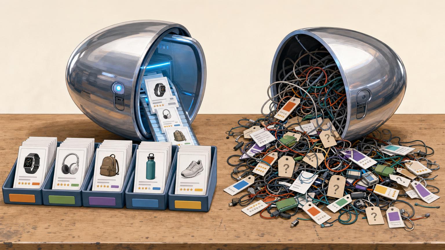

A collection earns its click when it solves one buying decision clearly.
A page titled “Affiliate Picks” asks shoppers to do too much work. Faced with a mixed grid of mugs, monitors, skincare, and camping gear, most people cannot tell where to begin—or why any item belongs there.
A stronger collection makes one practical promise: compact desk upgrades for small workspaces, beginner hiking essentials under $100, or coffee gifts for people who already own a grinder. That promise becomes the filter for every product. An item may be popular, well reviewed, and commission-friendly, yet still not fit the page if it does not help the same shopper solve the same problem.
Before adding links, write a one-sentence test: “This collection helps [specific person] choose [specific type of product] for [specific situation].” If a product cannot complete that sentence naturally, it belongs elsewhere.
Let the collection’s maintenance needs choose the structure
-
The list is large and keeps growing
A category archive is usually easier when dozens of products belong in the collection. New products can appear automatically once they receive the right category, without rebuilding the page.
Use a category archive whenA broad, expandable list with simple product cards.Prefer a curated page whenHand-arranging every item in a long, changing catalog. -
Prices, availability, or links change often
Archives reduce upkeep when products are added, removed, or temporarily unavailable on a regular basis. Consistent categories keep the collection current with fewer edits.
Use a category archive whenFrequent updates and a clear rule for inclusion.Prefer a curated page whenA fixed page that can quietly retain stale recommendations. -
Products belong to several collections
Categories work well when the same item should surface in multiple places, such as “Budget Cameras” and “Travel Gear.” One product record can support several archives.
Use a category archive whenReusable products with overlapping themes.Prefer a curated page whenDuplicating product entries just to place them on separate pages. -
The order needs an opinion behind it
A curated landing page earns its extra effort when ranking, short verdicts, comparison notes, and a clear “best for” choice matter. It can guide a small set of picks more convincingly than a neutral archive.
Use a category archive whenA short shortlist where sequence and commentary influence the choice.Prefer a curated page whenAn automatic grid when the recommendation depends on context.
Make every affiliate product card feel reliable
-
Use External/Affiliate as the product type
In WooCommerce, set each recommended item to External/Affiliate product rather than Simple product. Add the destination URL and a clear button label such as “Check price at retailer”; this prevents an affiliate pick from looking like it can be bought in the store.
-
Standardize the essentials
Give every record a specific product name, a short plain-language description, a featured image, and the same useful attributes—such as size, material, compatibility, or best use. Consistent fields make comparison quick, even when retailers present details differently.
-
Treat price as a useful snapshot
Add a current price or a “from” price only when it can be checked regularly. If pricing changes often, a retailer button without a stale number is more honest than a precise-looking figure that is wrong.
-
Keep the destination and disclosure visible
Check that each external URL reaches the intended retailer and opens as expected. A brief affiliate disclosure near the collection or product links helps readers understand the relationship before clicking.
-
Separate recommendations from store stock
Use distinct categories, badges, or page sections to keep affiliate picks separate from products sold directly. Direct-sale products need stock, shipping, and checkout expectations; external picks need retailer links and clear labeling. Mixing them makes both paths harder to understand.
For each new pick, reuse the same checklist: name, image, short verdict, key attributes, retailer URL, button text, and price-check date. It is enough structure for a tidy collection without turning a hobby project into a cataloging job.
Create a collection category that stays current
-
Name one specific shopping need
Choose a category name that describes a clear use case, such as “Compact travel coffee grinders,” rather than a broad department like “Coffee gear.” A narrow name tells visitors why these recommendations belong together.
-
Add the category in WooCommerce
Open Products → Categories, enter the name, and set a short, readable slug such as
travel-coffee-grinders. Add a brief description if the theme displays category text above the product grid. -
Assign only matching affiliate products
Edit each relevant external product and tick the new category in the Product categories panel. Leave out borderline items; a collection with six convincing picks is more useful than one padded with unrelated products.
-
Link to the category archive
WooCommerce creates an archive URL, typically
/product-category/travel-coffee-grinders/. Use that URL in menus, buttons, or articles. It refreshes automatically whenever products are added to or removed from the category, so the collection needs no separate page editing.
Review the archive after changes to confirm that its product count and category description still match the promise.
Tune the category archive for quick scanning
An affiliate category archive should support comparison, not feel like a crowded shop. First, check what the active theme exposes: themes designed for easier collection browsing may offer useful grid and archive controls, while others require a little CSS or a page-builder template.
Keep the grid readable
A three-column desktop grid is usually a comfortable starting point for product cards with an image, short title, and affiliate label. Let it fall to two columns on tablets and one on phones. Avoid squeezing four or more cards across unless each card contains very little text.
Set the default order to a deliberate custom/menu order or newest picks, then keep only helpful alternatives such as price or name. Hiding an irrelevant sort option is better than presenting a long, distracting menu.
Remove noise and explain the links
Disable sidebars, promotional strips, unrelated recommendations, and duplicate headings where the theme permits. Keep the category description above the grid, concise and specific:
Affiliate disclosure: Some links may earn a commission. Product buttons lead to third-party retailer websites, where prices, stock, delivery, and policies are set by that retailer.
This gives visitors the essential context before they start opening products.
Preview the category on a phone before publishing. A clean desktop grid can become a long, repetitive scroll when card spacing or images are oversized.
Build a small collection that reads like an editor’s shortlist
-
Start with a deliberately small set
A hand-built page works best for three to eight products, where every inclusion can earn its place. It is a better fit for “best starter kits” or “top travel tripods” than a category that needs to absorb dozens of new listings.
-
Use a filtered product block as the page backbone
Insert a WooCommerce product block, filter it to the relevant category or tag, and set the item limit. This keeps product data—price, image, availability, and external link—coming from WooCommerce rather than being copied into the page.
-
Set the sequence yourself
Order the products by menu order or another manual setting, then give the first position only to the strongest overall pick. A ranked list loses credibility when the order follows newest import date, price, or alphabet rather than the recommendation.
-
Add a short verdict above each card
A one-line label such as “Best overall,” “Best for tight budgets,” or “Worth it for frequent travelers” gives shoppers the reason to care before they inspect specifications. Keep the claim narrow and make sure it matches the supporting note beneath the product.
-
Keep the filter dependable as products arrive
The block can stay tidy only when imported items land in the right WooCommerce terms. Consistent category mapping for affiliate feeds prevents an unrelated product from quietly appearing in a carefully ranked shortlist.
Manual ordering needs a quick review whenever a product is removed, discontinued, or no longer the best pick.
Give shoppers enough to choose
A collection card is a decision aid, not a miniature sales page. Before a shopper leaves the site, it should show a recognizable product image, the exact model name, a current price cue, and one reason it belongs in the list. A vague stock photo or a shortened name makes comparison needlessly risky.
Use price language that matches the source rather than implying certainty. “From $49”, “Typically $49–$59”, or “Check current price at retailer” is safer than displaying a figure that may already be stale. If an item is unavailable, say so plainly—“Currently unavailable; similar option below”—instead of leaving a button that leads to disappointment.
The button should describe the destination. “View at REI,” “Check price on Amazon,” or “See retailer details” sets a better expectation than a generic “Buy now,” particularly when the site does not sell the item directly.
Add a short comparison note above or below the grid: for example, identify the best budget choice, the lightest option, and the pick for frequent use. Keep it to a few verifiable distinctions. When a product needs fit notes, testing context, alternatives, or a fuller explanation, build out the product pages behind the collection rather than cramming claims into the card.
Run a quick collection check
-
Open every outbound button
Test each retailer link in a private browser window. Confirm it reaches the intended product, uses the current affiliate URL, and does not land on a generic search page.
-
Review the page on a phone
Check that product images remain legible, buttons are easy to tap, and comparison notes do not become a long wall of text. A shortlist should be scannable in a few swipes.
-
Confirm labels and disclosures
Make the affiliate relationship clear near the collection or product cards, and ensure each product is assigned to the correct collection category. Remove old tags that could surface it in unrelated archives.
-
Check that shoppers can find it
Add the collection to an appropriate menu, landing page, or internal link. For a wider launch checklist, follow the complete WooCommerce affiliate store setup path rather than treating this page as an isolated feature.
-
Set a review reminder
Revisit the list monthly or after a major retailer sale. Replace unavailable items, retest destinations, and revise rankings when a former favorite no longer earns its spot.
A collection earns trust through upkeep
- A smaller list with current links is more useful than a large, neglected catalog.
- Regular review protects both shopper confidence and affiliate tracking.
A strong affiliate collection is a maintained recommendation, not a page that is finished once it publishes. Link testing, mobile checks, clear disclosure, and routine pruning keep the shortlist credible when products and retailer pages change.











15 responses to “How to Create a WooCommerce Product Collection Page for Affiliate Picks”
This worked way better than making a normal page full of affiliate links. I created a “Desk Setup Picks” category and the archive now updates itself whenever I add a new external product. Such a small change, but it’s much easier to maintain.
Glad it helped! That’s exactly where category archives shine: the collection stays current without having to edit a separate page every time a product changes.
I’m a little skeptical of three columns as a blanket recommendation. For products with long names or retailer-specific buttons, my cards got cramped even on a fairly wide laptop.
Two columns looked less “store-like,” sure, but people could actually read the verdict and see where the link went. I guess it depends on how much comparison text is on each card.
That’s a fair callout. Three columns are a starting point for quick-scan collections, not a rule. If your cards include longer titles, price notes, and editorial copy, two columns can be the more usable choice. The goal is that shoppers can identify the product and destination without squinting or opening every item.
Don’t skip the mobile check. My retailer buttons looked fine on desktop but wrapped into a weird two-line mess on my phone, and the disclosure ended up below the first row of products. Not ideal when the whole point is clarity.
Step 3 didn’t work for me quite the way I expected. My external products are in the collection category, but the archive is still showing a couple of regular shop items too.
Is that normally a category-assignment issue, or do I need a separate template/filter to show external products only?
Usually it means those regular products have also been assigned to the same category. Check the category field on each product first. If you intentionally need both product types elsewhere, a custom archive query or a filtered block can limit this particular collection to external products—but keeping the category exclusive is the simplest approach.
I ran into that too. Two old products had the category checked from a bulk edit months ago. Removing it fixed the archive immediately.
The point about honest prices is important. I see so many “best deals” pages with a price from last Christmas and then a surprise at checkout. If the price can’t stay synced, I’d rather see “Check current price at retailer” than fake precision.
Question about availability: do you remove an affiliate product as soon as it goes temporarily out of stock, or leave it with a note? Some of the retailers I link to flip stock status constantly.
I don’t want the collection to look abandoned, but I also don’t want to send someone to a dead product page.
For temporary stock changes, I’d usually keep a strong recommendation only if the retailer page still provides a useful restock option and you can label it clearly, such as “Currently unavailable” or “Check retailer for availability.” Remove or replace products when the destination is discontinued, redirects to something unrelated, or has stayed unavailable long enough that the recommendation is no longer useful. A scheduled link-and-availability review helps a lot here.
The distinction between a category archive and a curated shortlist finally clicked for me. I was trying to rank 30 products on one page… which was basically a spreadsheet wearing a cardigan 😅
I moved my top 6 into a curated page with short “best for” notes, then linked to the broader category for everyone else. Much cleaner.
“Spreadsheet wearing a cardigan” is painfully accurate. I did the same split for kitchen tools and the shortlist gets far more clicks than the giant all-in-one list.
That’s a strong setup. The shortlist gives visitors a quick editorial decision path, while the archive still serves shoppers who want to browse the full range.
The retailer-specific button advice is underrated. “Buy now” tells me nothing; “View at REI” or “Check price at Target” makes the jump feel much less sketchy. Also, visible affiliate disclosure near the collection is just good manners, not legal wallpaper.