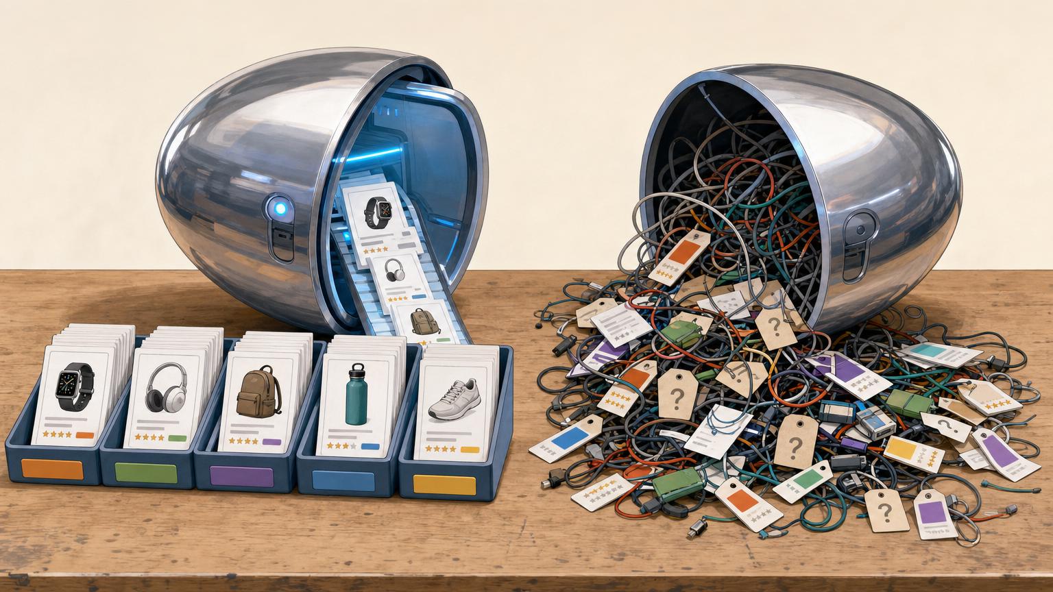


A recommendation box can look harmless until a phone has to load it on a weak connection.
On desktop, the publisher’s product cards appear neatly beneath a review. On a phone, the same spot may sit empty for a moment, then pop into place and shove the paragraph below it downward. That jump is often most noticeable when the reader is ready to tap a product link.
An affiliate widget is a sensible first thing to inspect: it may fetch scripts from another service, wait for product images or prices, and reserve too little space before its contents arrive. That does not prove it is the only slowdown. Large images, ads, consent banners, fonts, and a busy theme can create similar symptoms. The useful clue is timing: if the delay or layout shift begins around the widget’s position, it deserves a closer look.
Compare one page under the same conditions
-
Start with a stable test page
Use a staging URL or a duplicate page with the same images, theme, and content. Avoid a page changing because of campaigns, consent banners, or personalized recommendations during the test.
-
Create a widget-free version
Disable only the affiliate widget, rather than removing several plugins at once. This makes the difference in loading behavior easier to attribute.
-
Run matched PageSpeed tests
Test both URLs in PageSpeed Insights several times, using the same device profile. Note Largest Contentful Paint, Total Blocking Time, Cumulative Layout Shift, and the field-data panel when it is available.
-
Inspect the mobile loading timeline
In Chrome DevTools, record a Performance trace with mobile throttling. Look for new network requests, long JavaScript tasks, late card rendering, or layout-shift markers appearing only when the widget is enabled.
-
Judge the pattern, not one score
A small score change can be normal between runs. A repeated delay in product-card appearance, a longer main-thread block, or shifts beside the widget is stronger evidence than a single Lighthouse result.
Keep screenshots or exported traces from both versions; they make later fixes easier to verify.
Find the costly part first
A product display can look like one small card while loading a surprising amount of page weight. The product photo may be the largest cost, especially when a 1,200-pixel source is downloaded for a 180-pixel mobile slot. Several cards can multiply that mistake quickly.
Open the browser network panel on a throttled mobile test and group requests by type. The useful question is not simply whether the widget is slow, but which part arrives late or transfers too much:
- Images: oversized originals, duplicate thumbnails, or no modern format.
- JavaScript: an affiliate loader, tracking tags, carousel code, and extra dependencies.
- CSS and fonts: a widget stylesheet that blocks rendering or a new font family for prices and buttons.
- Data requests: product availability, live price, ratings, and stock checks that wait on an external API.
- Redirects: affiliate-link hops that matter most when a card prefetches or validates destinations.
A waterfall often makes the pattern visible: a long image download points to media; a delayed card after script parsing points to JavaScript; repeated API calls point to live data. Disable one category at a time in a test copy. For example, replace live stock with cached text before removing the whole widget. This preserves useful product information while revealing whether live features, visuals, or third-party code are the real mobile bottleneck.
Keep product images mobile-sized
A card image may look small on a phone while still downloading a 2,000-pixel desktop original. That wastes bandwidth, delays the card’s first paint, and can postpone nearby text. The image should be no wider than its displayed slot at the device’s pixel density; a 320 CSS-pixel slot often needs a 640-pixel source, not a full catalogue image.
Use srcset and sizes so browsers select an appropriate file, and serve WebP or AVIF where the publishing setup supports them. Keep a JPEG fallback if needed. Product photography can remain persuasive with a crisp primary image, sensible compression, and a consistent crop.
Trim galleries and reserve the frame
Show one main image in a compact widget. Extra angles, zoom files, badges, and thumbnail strips add requests quickly; load them only after interaction or on the product page. Images below the initial viewport can use lazy loading, but the first visible card image should not be delayed unnecessarily.
Every image needs width and height attributes, or a CSS aspect-ratio, matching its intended crop. The browser can then reserve the card’s image area before the file arrives, preventing captions, prices, and buttons from jumping downward.
In the network panel, compare each image’s transferred size with its rendered dimensions. Large files shown in tiny slots are usually the easiest mobile savings.
Cut the widget’s JavaScript work
A product widget can look small while asking a phone to parse, execute, and schedule several scripts. In a performance trace, long yellow scripting blocks shortly after the widget loads are a stronger warning sign than minor styling differences.
Remove what the card never uses
Check the widget configuration and loaded files for features that are absent from the page: comparison controls, carousels, review pop-ups, tracking add-ons, extra currency tools, or recommendation code. Disabling a module is preferable to merely hiding its interface with CSS; hidden controls can still run JavaScript.
- Load one affiliate library, not a copy from the theme and another from a plugin.
- Delay optional enhancements until after the main content is usable, or until the card enters the viewport.
- Avoid initializing the same widget twice after navigation, consent changes, or page-builder updates.
Question every live request
Live price and stock checks add network waits and often trigger another render. For a basic affiliate link, a cached price, an update timestamp, or no displayed price may be more useful than a card that arrives late. Live data is most defensible when it changes a purchase decision often enough to justify the extra work.
After each change, repeat the matched mobile test. A shorter script task and earlier interaction response are better evidence than a card that simply looks cleaner.
Fix the widget’s on-screen behavior
Fast network results do not guarantee a usable mobile page. A widget that expands after its data arrives, starts a carousel, or pins itself over content can make the first screen feel unfinished even when the load report looks acceptable.
Match the symptom to the structure
- Cards jump taller after appearing: reserve space for the title, price, disclosure, and image. A fixed or minimum card height prevents late text and badges from pushing the article downward.
- A horizontal carousel feels sluggish: show one or two static recommendations first, or replace the slider with a simple stacked list. Carousels add controls, measurements, and touch handling that rarely help a small affiliate block.
- An embedded offer loads in an iframe: use a plain product link or a lightweight card where possible. Iframes can bring separate styles, scripts, and resizing behavior that the page cannot easily control.
- A sticky bar covers reading space: keep it short, delay it until the reader has scrolled, and provide a clear close button. It should never hide the headline, opening copy, or primary navigation.
Keep the first viewport focused on the article. Product modules work better below the opening passage, where a small delay is less disruptive.
Pick a Widget That Earns Its Weight
-
Start with the requests
A replacement should add few requests and avoid live calls before the card is visible. When choosing a faster product-box plugin, test its empty-cache waterfall rather than trusting its feature list.
PreferOne stylesheet, modest script, and no mandatory API round trip.SkipSeveral vendor domains, redirects, or a loader that fetches more loaders. -
Treat images as part of the plugin
Check whether it serves responsive image sizes, lazy-loads below-the-fold cards, and reserves the image ratio. A small thumbnail can sell the item just as effectively as a large gallery on a phone.
PreferMobile-sized WebP or AVIF images with fixed dimensions.SkipFull-size source files, sliders, or thumbnails that cause layout shifts. -
Keep embedded content optional
Iframes, ratings feeds, and stock widgets can be useful, but each may bring its own scripts and cookies. Cache-friendly static output is usually easier to keep fast.
PreferControls to disable feeds, badges, and extras per card.SkipRequired iframes or dynamic data that defeats page caching. -
Require a graceful fallback
The product name, price text, and affiliate link should still work if the widget fails or is disabled. For some pages, a plain linked image and short disclosure are the faster choice.
PreferA simple HTML link fallback and individual feature toggles.SkipA card that disappears when its script cannot run.
Use a simpler page-level fallback
For many articles, a dynamic product block adds more machinery than the page needs. A short, well-placed list of plain affiliate links is often faster, easier to maintain, and less distracting on a phone.
A useful fallback can include the product name, one specific reason it fits the article, and a clear destination. For example:
- Budget pick: Product A — compact option for occasional use.
- Upgrade pick: Product B — better suited to frequent use.
- Check current price: Product C at the retailer.
These lighter ways to show product links work especially well below a review conclusion or beside a comparison table. They also keep the page useful if an affiliate feed fails.
For a small number of high-traffic pages, a manually built HTML box can be worthwhile. Use compressed, fixed-size images, write the copy directly in the page, and update prices only when needed. If frequent pricing, stock, or product rotation is not essential, static content usually avoids an unnecessary performance layer.
Run the same final check every time
-
Clear the caches first
Purge the site, CDN, and widget caches, then use a private browser window. Otherwise, an old script or product image can make the published result look better than it is.
-
Repeat the matched page test
Test the same page, device profile, and network conditions used before the change. Compare load time, layout movement, and the point at which the product card becomes usable.
-
Check both lab data and a phone
A lab run catches repeatable regressions; a real phone on an ordinary mobile connection reveals awkward pauses, sticky-bar crowding, and delayed taps that synthetic tests can miss.
-
Verify every affiliate detail
Open each affiliate link, confirm the destination and tracking, and check that displayed prices are current or clearly qualified. Make sure the required affiliate disclosure remains visible near the recommendation.
-
Let earnings confirm the choice
After release, watch clicks and conversions alongside page-speed data. A lighter widget has earned its place when readers still reach merchants and completed sales do not fall.
Record the test date and page URL so later changes have a useful baseline.
An affiliate display does not need live prices, animated badges, or a full product carousel to do its job. The best version is usually the smallest reliable presentation that gives readers enough information to choose a link and lets the merchant page finish the sale.
Keep the lighter version only while it still produces meaningful commissions. Recheck earnings after each cut, alongside mobile loading and layout stability. If a feature does not help readers or revenue, remove it.