

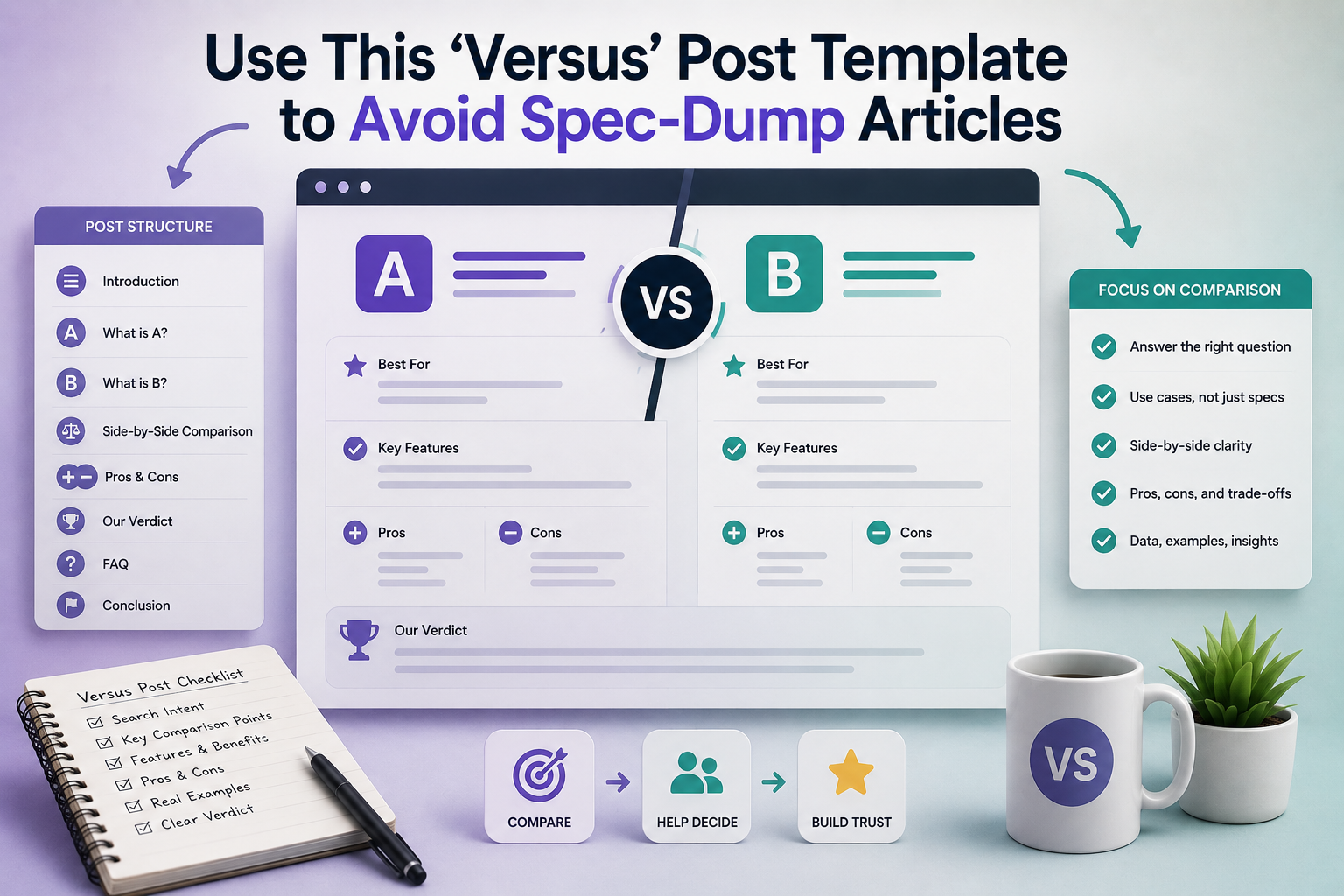
Two polished spec tables can still leave the better option invisible.
How can a comparison look exhaustive and still feel useless? A draft piles up screen sizes, battery ratings, chip names, and price tiers until it appears serious. Yet the reader reaches the end with the same problem: no sense of which differences actually matter.
That happens when the piece reports features instead of trade-offs. Numbers without context flatten everything. A 0.2-inch display gap means little; glare outdoors, hand fatigue, repair cost, or software support may decide the purchase. Thoroughness is not the same as guidance.
Stop comparing like a spreadsheet
Spec-dump comparisons confuse coverage with helpfulness. They stack every feature, benchmark, and edge case until both options look equally qualified. The reader leaves with more tabs open, not less certainty.
Versus searches are rarely requests for maximum information. They are requests for decision compression: reduce the field, surface the differences that change the outcome, and cut everything else.
A strong comparison does three things:
- names the criteria that matter for this buyer and use case
- gives those criteria visible weight instead of treating every row as equal
- ends with a clear recommendation
Objectivity does not mean refusing to choose. It means making the tradeoff logic visible. If price matters less than automation, or ease of use matters more than raw flexibility, the scoring should say so — and the verdict should follow from that weighting.
A calm tone is not objectivity. A fair versus post can still say Option A is the better default if the losing conditions are named plainly.

Build clearer comparison pages
When a verdict needs live prices, synced availability, and clean comparison blocks, Content Egg Pro helps make the recommendation easier to verify.
Define the decision before picking criteria
A strong versus post starts with one buyer decision, not two product names. The question might be best for solo editing on a laptop, best for multi-site inventory sync, or best for a small team that needs approvals. Once that decision is fixed, irrelevant specs fall away on their own.
Selectivity is a strength, not a gap. If battery life will never affect the purchase, it does not belong in the comparison. If API limits, onboarding time, or migration risk could change the recommendation, those deserve space even when they are less marketable than headline features.
When the matchup is wrong
Sometimes the products do not solve the same job. One may be an all-in-one platform while the other is a point solution. In that case, forcing symmetry creates a false contest. The better move is to reframe the article around which kind of buyer fits each option, or split the topic into separate comparisons.
Keep only criteria that can flip the verdict
-
Decision-linked
Each criterion should connect directly to the purchase scenario.
Look forA clear path from criterion to final recommendationAvoidInteresting details with no effect on the choice -
Outcome-changing
Include factors that could realistically make one option win.
Look forPricing model, workflow fit, limits, support, switching costAvoidFeature counts or raw specs treated as equal -
Same job to be done
Both products should address the same core need.
Look forComparable use case and buyer intentAvoidDifferent categories dressed up as rivals -
Evidence-ready
Every criterion should be testable or supportable with proof.
Look forBenchmarks, hands-on checks, documented limitsAvoidVague claims like "better for pros"
If the comparison only works after heavy caveats, that is the signal. The article may need a new angle: A vs B for enterprises, A vs B for beginners, or A vs a different competitor entirely.
Lead with the answer
Open with the conclusion, not a slow reveal. A strong versus post states who should choose each option and names the factor that decided it. That immediately lowers uncertainty and turns the rest of the piece into proof instead of scavenger hunting.
The verdict should sound like plain English, not a courtroom brief: A fits small teams that need fast setup; B suits complex environments that need tighter control. If a reusable blog comparison table template exists, aligning the verdict with those same criteria makes later updates cleaner and less error-prone.
- Answer early State the winner, ideal fit, and deciding factor in the opening.
- Explain impact Translate differences into outcomes such as speed, effort, risk, or cost.
- Keep aligned Match verdict language to table criteria to avoid drift during updates.
Use a fast decision map
The table should help readers decide in seconds, not archive every spec. Limit it to criteria that can actually flip the recommendation—setup time, pricing model, integration depth, reporting quality, or compliance support. Each row should answer a practical question: What changes for the buyer if this side wins?
Rows written as consequences beat rows written as labels. Examples:
- Onboarding: hours vs. weeks
- Admin load: light vs. ongoing
- Governance: basic vs. advanced
That structure is also easier to maintain. Reusable comparison components make updates faster, reduce contradictions between table and verdict, and keep older posts trustworthy when products change.
Turn each criterion into a consequence
A strong versus section follows the same sequence every time: difference → consequence → affected buyer → judgment. That order prevents feature trivia from crowding out the buying decision.
The four-part paragraph
For each criterion, state:
- What differs: the concrete gap, not the brand claim.
- Why it matters: the operational effect on speed, cost, quality, risk, or effort.
- Who feels it most: beginner, power user, team admin, budget buyer, high-scale operator.
- What follows: a plain verdict for this criterion.
A useful sentence pattern is: “Product A does X; Product B does Y. This matters because it changes Z. The gap is most noticeable for . On this criterion, is the better fit.”
This structure forces translation from specs into lived outcomes. More storage becomes longer retention before cleanup. Faster sync becomes fewer duplicate edits. Open API access becomes lower integration cost for technical teams, but little value for solo buyers.
A difference deserves space only if it changes the recommendation. If the effect is negligible for the target buyer, mention it briefly or cut it.
Let the weaker option win sometimes
Trust improves when the comparison admits the other product’s real advantages. If the recommended option loses on setup speed, beginner friendliness, a niche feature, or a compliance need, that should appear plainly.
The important move is to contain the win: state who benefits, under what conditions, and whether it changes the overall call.
- Strong: “Option B is better for teams that need approvals on day one.”
- Weak: “Option B also has some nice features.”
That difference keeps nuance from blurring the verdict. It signals that both sides were tested, not merely arranged to support a foregone conclusion.
Use commercial context as evidence
Price belongs in the comparison only when it changes the recommendation. A higher upfront cost can still be the better pick if migration, training, add-ons, or failure risk make the cheaper option more expensive over a year.
Useful decision modifiers:
- Long-term cost: renewals, required extras, implementation time
- Guarantees: refunds, support terms, post-expiry rights
- Sentiment: repeated praise or complaints across credible reviews
- Availability: stock, regional access, API limits, waitlists
If none of these alters the outcome, a brief note is enough. If one flips the verdict for a specific segment, it deserves a clear sentence in the recommendation.
Final cleanup pass
-
Remove orphan specs
Cut any detail that does not change the likely winner for a defined buyer.
-
Check paragraph-to-verdict alignment
Each paragraph should support the main recommendation, an exception, or a meaningful caveat.
-
Keep only decision-moving differences
If two products are effectively equal on a point, collapse it into a short note.
-
Bound the recommendation
Name who should not follow the headline pick and why.
Finish with a drift check and a reusable skeleton
Before publishing, run one last edit for decision drift. If a sentence cannot change the reader’s choice, it is probably filler.
Paste-in skeleton
- Best for: [buyer, use case, budget band]
- Choose A when: [top 2–3 conditions]
- Choose B when: [top 2–3 conditions]
- A wins on: [criterion] → [real-world consequence]
- B wins on: [criterion] → [real-world consequence]
- Watch-outs: [migration cost, hidden fees, support limits, missing integrations]
- Bottom line: [one-sentence recommendation plus exception]
This structure keeps the article anchored to outcomes, not inventory. It leaves room for nuance without inviting a long march through every spec.
Do buyers need full specs?
Only if a spec changes the verdict. Extra detail can sit below the recommendation.
What if the tools are close?
Say that plainly. Honest narrow wins build more trust than forced certainty.
Will a template sound generic?
Not with selective criteria. Structure removes bloat and leaves room for nuance.
Publish smarter comparison posts
Content Egg Pro helps WordPress publishers build verdict-led reviews with real price comparison and reusable blocks.
Clarity wins. Strong versus posts answer the buying question fast, highlight decisive trade-offs, and help readers choose—without drowning them in specs.











30 responses to “Use This ‘Versus’ Post Template to Avoid Spec-Dump Articles”
I liked the cleanup pass section because honestly that’s where our team fails every single time.
Draft starts with a clear decision, then three edits later somebody adds “also mention integrations, API limits, export options, custom branding, mobile app…” and suddenly it’s back to spec soup.
The phrase decision-drift is painfully accurate 😂
This worked for me, surprisingly fast.
I rewrote one post using the verdict skeleton and cut about 1,200 words of pure spec mush. Rankings didn’t tank, and time on page actually went up a bit. So apparently fewer bullets, more decisions = better. wild.
Minor gripe: I wanted one concrete before/after example of a bad spec-dump paragraph rewritten into consequence format.
The pattern makes sense, but I think a side-by-side would’ve made it even easier to hand off to writers who are used to feature-by-feature recaps.
That’s fair feedback. A side-by-side example would make the shift more tangible, especially for teams retraining writers out of old comparison habits.
I’ll likely add one in a future update because it’s a common sticking point.
Same thought. I got it conceptually, but an actual ugly paragraph -> better paragraph transformation would be super useful.
Noted. That kind of example tends to remove a lot of ambiguity, so it’s worth adding.
The objection-handling part at the end was solid. “Selective templates beat exhaustive specs” sounds obvious when you say it plainly, but a lot of content teams still act like leaving something out is a sin.
Meanwhile readers are just trying to answer one question and get on with their day.
The reusable components part made me happy in a very nerdy way.
We manage dozens of comparison pages, and the updateability problem is real. If each criterion follows the same pattern and the table focuses on consequences instead of random attributes, maintenance gets way less chaotic.
The “bad matchups should be reframed” line hit hard.
We had a draft comparing two tools that were technically in the same category, but one was clearly for enterprise buyers and the other was for freelancers. We kept trying to make the table fair instead of admitting it was the wrong comparison.
Reframing around use case solved it. Traffic stayed about the same, but conversions improved because the page stopped pretending both were equal fits.
That’s a great example. A lot of weak versus pages come from trying to force symmetry where the actual buyer context is different.
Once the framing changes from “which has more stuff?” to “which is the better fit for this decision?”, the whole article usually gets easier to write and easier to trust.
Yep, same here. We had one of those nonsense “enterprise suite vs lightweight app” comparisons and the only honest answer was basically “depends who you are.”
Trying to flatten that into a universal winner made the article worse.
I’m in-house and this kinda exposed one of our biggest bad habits.
We’ve been treating comparisons like a place to “prove we did research,” which usually means dumping every spec we can find into the page. It *looks* authoritative, but sales keeps telling us prospects still ask basic fit questions after reading.
So yeah, maybe the page isn’t actually doing its job if the answer isn’t clear by the end.
That’s a very common trap. Research visibility feels like authority, but authority isn’t the same thing as decision support.
If prospects finish the page with more information but not more clarity, the comparison probably needs a tighter frame and a stronger verdict path.
Step-specific issue here: the “turn each criterion into a consequence” part sounds good in theory, but I got stuck when the feature difference was real yet the impact was small.
Example: one platform has a slightly better export format. It matters to like 8% of buyers, not most. Do you still include that criterion if it’s meaningful to a narrow segment, or does that just clutter the post again?
Good question. If the difference is real but only decision-changing for a narrow segment, I’d usually keep it *only* if you label the segment clearly.
That’s where an exception-style note works well: explain who it matters to, what the consequence is for them, and avoid presenting it as universally important. If it doesn’t affect the main buyer decision, it shouldn’t get equal visual weight with core criteria.
This is where little callouts helped us. We use a short “matters if…” line so niche criteria don’t hijack the whole comparison.
Not gonna lie, I think some readers still expect a fairly exhaustive table.
If I land on a comparison and the writer only chose 4 or 5 criteria, part of me wonders what got left out. Maybe that’s a trust problem on my end, but I can see why teams overcompensate with giant tables.
That’s a real concern, and it’s one reason selective comparisons need to be transparent rather than minimal for the sake of it.
If you explain the decision being made and choose criteria that actually change the verdict, readers usually accept a shorter table more readily. A long table can feel safer, but it often hides the important differences instead of clarifying them.
I tried applying this template to a comparison that was already ranking, and weirdly the hardest part was deleting things.
Everyone on the team had a pet criterion they wanted to preserve. The article made it sound simple to keep only verdict-changing points, but in practice that became a mini political battle in our content doc 😅
Still, after the rewrite, the page was clearer. So annoying process, good result.
This is the first explanation of “versus content” that actually made me stop doing the giant feature checklist thing.
The part about defining the buyer decision *before* picking criteria was the lightbulb moment for me. I realized half our comparison pages were answering 3 different questions at once, which is probably why they felt “complete” but didn’t help anyone decide.
I mostly agree, but I’m still not fully sold on leading with the answer in the intro.
Sometimes readers *want* to inspect the evidence before they trust the recommendation, especially if the site has affiliate links. Do you ever worry that a verdict-first opening can feel like the conclusion was decided in advance?
Fair pushback. Verdict-first can absolutely feel premature if it isn’t supported fast.
The reason I recommend it is that readers usually came with a decision question already, so giving the answer early lowers uncertainty. The key is to make the intro concise, specific, and immediately followed by evidence-backed criteria rather than hype.
I had the same reaction at first, but honestly I prefer knowing where the writer lands right away. If the reasoning is weak, I bounce. If it’s strong, I keep reading.
The TCO framing section was probably the most useful part for me.
We kept letting the cheaper monthly price “win” in drafts even when setup time and add-ons made it more expensive over a year. Once we switched to total cost in the actual buyer scenario, the weaker option stopped winning on a technicality.
That one change made our recommendations look way less biased.
I appreciated the point about letting the weaker option win sometimes.
Too many comparison posts feel rigged because Brand A somehow wins every single category and every single audience. In real buying decisions there are always edge cases, budget cases, or implementation cases where the “loser” is the smarter pick.
That nuance is what makes a comparison believable.
Exactly. If one option supposedly wins for everyone in every context, readers rightly get suspicious.
Calling out segment-specific exceptions doesn’t weaken the comparison. It usually strengthens trust because it reflects how real decisions work.
100% this. I’ve literally stopped reading some comparison pages because they felt like courtroom closing arguments, not analysis lol.
That’s a good way to put it. Once the page starts sounding like advocacy without constraints, the comparison loses credibility fast.
“Stop comparing like a spreadsheet” should be taped to my monitor lol.
I write for a B2B site and we kept stuffing every row with tiny differences that never changed the outcome. Tried your consequence-based angle on one draft this week and it immediately read more like advice than inventory.
That’s exactly the shift I’m aiming for. A lot of comparison drafts feel thorough because they contain more rows, but if those rows don’t change the decision, they mostly create friction.
Glad the consequence-based framing helped the draft sound more advisory.