
More facts can make a decision feel harder, not clearer.
A familiar moment: the table is packed with prices, specs, warranties, integrations, and still the choice feels stubbornly muddy. That frustration usually is not a data problem. It is a decision design problem.
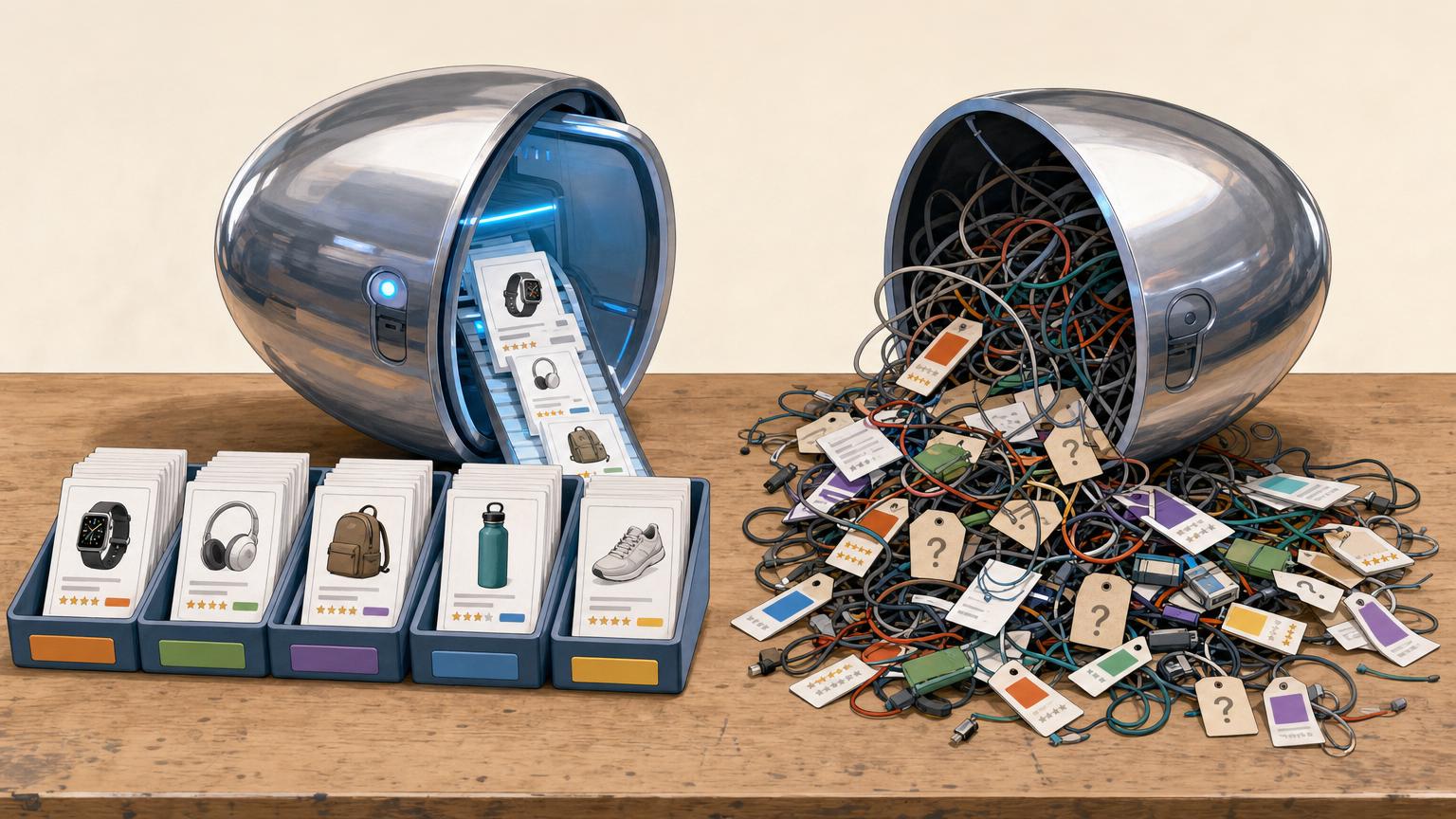
A comparison table only speeds things up when it reflects what actually matters most and leaves out what does not change the outcome. Once every possible detail gets equal space, signal turns into noise. The real work is prioritization—deciding which differences deserve attention—and omission—removing rows that look useful but do not affect the final call.
Start with the decision, not the table
The right table begins by naming the decision it must speed up. A table for product comparison articles can serve very different moments: scanning the market, narrowing choices, or approving a final pick. Each moment changes what belongs in the rows and columns.
For a shortlist, the desired outcome is simple: a small set of viable options worth deeper review. The table should focus on fast eliminators:
- use-case fit
- budget range
- must-have features
- deal-breakers such as compliance, size, or platform support
For a final selection, the outcome is different: one defensible choice ready for purchase or sign-off. That version should compare fewer options but add stronger evidence:
- implementation effort
- total cost, not just list price
- support levels, contract terms, and risk
- proof from trials, references, or benchmarks
A useful test is this: if the table cannot show what happens after the reader reaches the bottom, it is still too generic.
Narrow the columns before the table gets crowded
-
Keep options in the same buying class
Compare products that solve the same job at roughly the same level of complexity, price band, and deployment model. A lightweight tool and an enterprise suite rarely belong in one honest side-by-side.
-
Set a hard column limit
Once the list grows beyond about five to seven realistic choices, visual scanning slows and row-by-row judgment gets fuzzy. Cut weak fits before building the table, not after.
-
Remove obvious non-starters early
Drop anything that fails a must-have requirement such as budget ceiling, compliance need, team size, or technical environment. Columns that cannot win only create false diligence.
-
Split mixed candidates into separate tables
If options serve different segments, make one table for each segment or use case. Separate tables produce cleaner criteria, fairer scoring, and fewer misleading trade-offs.
-
Treat edge cases as notes, not main contenders
A niche option can be mentioned below the table when it matters for a special scenario. That keeps the comparison focused on real finalists.
When columns represent different market tiers, the table rewards the wrong things. A budget tool may look weak on advanced features, while a premium platform may look overpriced for a simple task. If the use case is not shared, the comparison is not neutral.
Order rows by decision value
-
Must-haves firstPut non-negotiables at the top: legal requirements, critical integrations, budget limits, deployment model, or capacity thresholds. If an option fails here, it should stop being discussed.Look forRows that can eliminate an option immediately.AvoidBurying deal-breakers under nice-to-have features.
-
Major differentiators nextAfter screening, compare the few factors that most change outcomes: speed, reliability, support depth, learning curve, or total cost over time. These rows separate viable choices from the best fit.Look forAttributes that clearly favor one strong candidate over another.AvoidLong lists of minor feature differences with no real impact.
-
Meaningful tradeoffs after thatSome rows matter because no option wins cleanly. Surface tensions such as flexibility versus simplicity, performance versus price, or control versus maintenance burden.Look forRows that explain what is gained and what is given up.AvoidPretending every difference has a single obvious winner.
-
Edge-case details lastRare scenarios, niche admin settings, and unusual exceptions belong near the bottom or in notes. They matter only once core fit is already clear.Look forDetails relevant to a small subset of cases.AvoidLetting uncommon needs dominate the ranking for everyone.
If a row cannot eliminate an option, confirm fit, or explain a real tradeoff, it probably does not belong in the main table. Move it to notes, or cut it entirely.
Make every cell comparable at a glance
A good row can still fail if the cells mix different meanings, units, or time frames. Each cell should answer the same question in the same form, so the eye compares values instead of decoding them.
Normalize before filling
Use one rule set for every row:
- Same unit: GB, not a mix of GB and “unlimited.” If needed, translate to a capped estimate or mark as not directly comparable.
- Same time basis: monthly price, annual price, and lifetime cost should not share a row. Convert to one period.
- Same test conditions: battery life, speed, throughput, or support response time must come from matching workloads, regions, and brightness levels.
- Same inclusion rules: note whether setup fees, taxes, storage limits, or premium support are included.
- Same date/source: stale benchmarks beside current ones create false gaps.
When data cannot be normalized, the fairest move is to split the row or add a short qualifier in the cell, not a paragraph below the table. For example, use “$29/mo billed annually” only if every price cell follows that convention. Visual alignment is easy; decision-grade alignment comes from shared definitions.
If two adjacent cells cannot be read aloud as one sentence stem — “Response time is …” — the row probably needs reworking.
Add cues that speed the choice
Raw figures help compare options, but decision cues help readers act on them. A compact table often benefits from one extra layer of interpretation: not sales language, but clear signals about fit, tradeoffs, and likely outcomes.
Useful cues include:
- Fit labels: “Best for small teams,” “Strongest offline option,” or “Good value at high volume”
- Strengths: the one or two areas where an option clearly leads
- Limitations: known gaps, hidden costs, setup burden, or missing features
- Pricing context: entry price, real operating cost, or when a higher tier becomes necessary
- Verdict cues: “safe default,” “specialist pick,” or “worth it only if a specific need exists”
These cues work best when they are tied to evidence already visible in the rows. If the table says one tool is “best value,” the pricing row and included features should make that claim obvious.
Scores are riskier. A single total can hide deal-breakers and imply false precision unless the weighting logic is shown. When scoring is used, the table should reveal:
- which criteria are must-haves versus preferences
- the weight assigned to each criterion
- how the final score was calculated
Without that transparency, labels usually guide better than numbers.
A high total score can still mask a fatal weakness. If one missing requirement eliminates an option, treat it as a gate, not part of the average.
Shortcuts that make a table look smarter than it is
More rows often make the real decision harder to see.
If a row cannot eliminate an option, expose a tradeoff, or explain a final choice, it adds scanning time without adding confidence.
Unverified claims create neat-looking but unreliable comparisons.
Prefer tested results, contract language, support policies, and dated sources. That is one practical way to make comparisons feel less biased.
A total score is useful only after deal-breakers and evidence quality are visible.
Keep must-have failures, missing data, and uncertain assumptions separate from weighted scores so a high total cannot hide a critical weakness.
A faster table is not a thinner opinion. It is a tighter set of verified, decision-relevant criteria.
Test the table before it does the deciding
-
Lead with deal-breakers
Place exclusion rows first: compatibility gaps, hard limits, required features, contract blockers.
-
Follow with true separators
Next, show the few rows that actually split viable options on speed, cost, risk, or support.
-
Run a 30-second scan
If a reader cannot name the top two candidates in half a minute, the order is still too noisy.
-
Force a shortlist
Hide lower rows and see whether the same 2–3 options still survive. If not, weak criteria are steering the choice.
-
Use the readiness check
The table is ready when eliminators are obvious, tradeoffs are visible, and one extra row rarely changes the ranking.
A quick finish beats a bigger table
- Front-load eliminators.
- Test with a timed scan.
- Keep only rows that change the shortlist.
A finished table should make the first cut almost immediately. If the likely finalists are not obvious fast, the sequence still needs work.
If the structure is close but not reusable yet, move straight into a template: a broad comparison table for screening, or a versus template for the final two.