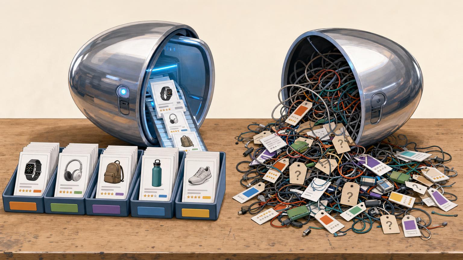


A reader does not need to finish the page to be ready to choose.
After comparing two camera straps, checking whether one fits a mirrorless body, and seeing a clear price range, a reader may already have enough information to buy. If the relevant link sits after another 1,500 words, that decision can quietly turn into an exit.
Place an affiliate link when the page has answered the question that makes a click feel sensible. That might be immediately after a concise recommendation, a comparison table, or a short note about who a product suits. It need not wait for a grand conclusion. A later link can still serve readers who want every detail, but the first useful opportunity should appear while intent is warm—not before the reasoning, and not buried beneath it.
- A natural first link often follows the first clear verdict, rather than the final paragraph.
Match the first link to search intent
A visitor’s search phrase usually reveals the decision they came to make. The first affiliate link belongs immediately after that decision has been answered with enough evidence—not after an arbitrary introduction.
Quick answers
For a query such as “best budget camping stove,” the visitor wants a fast shortlist. A brief selection note, the top pick, and one reason it fits can support a link near the opening. The link should lead to the named stove, not a broad category page.
Reviews and comparisons
A review visitor is testing one product: Is this worth buying? Place the first link after the verdict, key benefit, and a meaningful limitation. In a comparison, wait until the article identifies who each option suits; then link the recommended option beside that conclusion.
Tutorials
Tutorial visitors arrived to complete a task, not necessarily shop. Keep early links limited to tools or materials required for the next step. A link to an optional upgrade works better after the basic method has already solved the immediate problem.
Before adding a link, name the visitor’s next decision in a few words: choose a product, compare options, or get the needed tool.
Give the first link a reason to exist
Early skimmers do not need a long preamble, but they do need a reason to trust the destination. A bare claim followed by a link asks for a click before the page has shown any judgment, criteria, or fit.
Before:
The TrailGlow 500 is the best headlamp for camping. Check today’s price.
“Best” is doing all the work here. A reader who has not yet heard why it suits camping has little reason to leave the article.
After:
For occasional campsite use, the TrailGlow 500 is a practical pick because its wide flood beam is easier to use around a tent than a narrow distance-focused light, and its simple AAA batteries are easy to replace on a trip. It is less suitable for long night hikes, where battery life matters more. Check the TrailGlow 500’s current price.
The link now follows a small, concrete decision: what the product does well, who it suits, and one meaningful limitation. That context lets a fast reader decide, “This sounds like my use case,” before opening a retailer page.
Keep the setup brief—usually two or three specific details are enough. The aim is not to delay the link; it is to make the click feel earned.
Repeat links at decision points
A reader rarely decides at the first mention. They pause after each new piece of evidence and ask whether the product still fits. A second or third affiliate link can help at those moments—but only when it accompanies a new reason to act.
Use the pauses already in the page
Place a fresh link after a key benefit has been demonstrated: for example, when a compact tripod is shown to pack down small enough for day hikes. Add another after resolving a likely objection, such as explaining that its lighter build is steady enough for a phone but not a heavy camera.
A comparison creates another natural pause. Once a table or short verdict establishes that one model is the better value for beginners, link to that specific option beneath the conclusion.
The final recommendation deserves a clear route as well. Keep it specific: “For occasional hiking videos, check the lightweight model here.” Avoid turning every repeated product name into a link. Repetition should track progress in the decision, not page length.
Let intent determine the format
A link should become more noticeable only as the reader moves from learning to choosing. A bright button near the opening can feel premature; a plain text link at the final recommendation can be too easy to miss.
A practical placement guide
| Reader moment | Best format | Where it fits |
|---|---|---|
| Exploring a problem | Contextual text link | After explaining a relevant feature, use case, or term. |
| Comparing a short list | Recommendation box | After the comparison table or a clear “best for” conclusion. |
| Ready to check price or buy | Action button | Directly below the final recommendation, with the main trade-off stated nearby. |
A contextual link can say, “See current sizes and colours,” because it continues the sentence without demanding a decision. A recommendation box earns its space when it gathers the essential fit: who it suits, one limitation, and a link. Reserve buttons for readers who have already seen enough evidence to act.
Button copy should name the next step, not manufacture urgency. “Check current price” or “View the beginner kit” is clearer than “Buy now.” If the same product appears again, vary the surrounding reason—for example, price after a comparison, then availability after a fit-specific verdict.
Place links beside the decision
A comparison page becomes commercially useful when it tells readers who each option suits, not merely which spec is larger. Put one linked Best for label beneath each product name or at the end of its mini-verdict: Best for small apartments — check current price.
The link should follow the finding that settles the choice. If one blender is notably quieter, easier to clean, or more compact, state that observation first, then attach a restrained link to the product name or a short action phrase. A claim such as “its 48-ounce jar is the better fit for batch cooking” gives the click context.
End each comparison with a simple fit call
Use a direct closing recommendation when the evidence points clearly in one direction:
- Choose Model A for occasional use and limited counter space. [See Model A]
- Choose Model B for larger batches and dishwasher-safe parts. [See Model B]
Keep comparison tables for scanning, not selling. Link each product name in the header, or add a single Check price row at the bottom. Filling every spec cell with links makes the table noisy and obscures the differences readers came to judge.
Treat the final CTA as a last helpful path
Use the closing CTA as a recap for readers who reached the end, while keeping earlier links beside supported decisions.
Many readers leave after finding their answer halfway down the page. A final button cannot recover a missed moment of intent.
Repeat links only when the reader has gained a new reason to choose: a resolved concern, a comparison result, or a clearer fit.
Frequent, unchanged CTAs feel like interruption. A well-timed repeat feels like a useful shortcut.
Place a short, plain disclosure close to the recommendation and the action link.
Readers should see the relationship at the point it may affect their decision, not after clicking away.
A brief line such as “This link may earn a commission at no extra cost” can sit directly above or below the final button. It need not interrupt the reading flow, but it should not require hunting through a footer.
The same rule applies to earlier recommendation links. For practical examples of placing disclosures beside affiliate recommendations, keep the wording plain and near the relevant link rather than relying on one remote site-wide notice.
Audit the page on a phone
Open the published page on a phone, not merely a narrow desktop window. Scroll as a reader arriving from search would. The first useful recommendation should appear soon after its supporting evidence, without requiring a long detour through introductions, images, or expandable blocks.
Check each link at the point it is meant to help. Its label should be fully visible, easy to tap, and close enough to the relevant verdict that it does not look detached. A button that sits alone after a large image, or a comparison table that needs several sideways swipes, creates unnecessary friction.
Record clicks by position, such as first text link, comparison-table link, and final button. Pair that view with a way to track revenue by page, then look for patterns over a meaningful number of visits. A handful of clicks can suggest a question to investigate, but rarely justifies moving every link.
Use a real phone and a normal connection. Note where the first recommendation appears, whether every tap target is comfortable, and whether tables force horizontal scrolling before a choice is clear.
Run this five-minute link check
-
Find the first useful action
Read the opening on its own. The first link should follow a clear benefit, fit, and limitation—not appear before the recommendation has earned trust.
-
Check every decision point
At a shortlist, comparison result, objection answer, or final fit statement, confirm that a nearby link answers the reader’s next practical question.
-
Make disclosure visible
Place a plain affiliate disclosure close enough to the first promotional link that it is noticed before a click.
-
Give late deciders one clear exit
End with a specific CTA that names who the recommendation suits. It should add a helpful route, not repeat a vague “learn more” button.
-
Review on a phone
Check link spacing, button visibility, table overflow, and whether the CTA remains attached to its supporting verdict. These small checks support better affiliate conversion performance without adding more links.
- A link converts best when it follows evidence and resolves the next decision.
- One visible disclosure and a mobile check protect clarity at the moment of action.
Strong placement is a sequence: establish value early, offer links when a decision becomes real, disclose the relationship, and leave a clear final path. A quick phone review confirms that the sequence still works where many readers will see it.











23 responses to “Where to Place Affiliate Links Before Readers Leave”
One caution from an editor’s perspective: “performance patterns by position” can be misleading if the same product is linked with different wording. An early text link and a late button aren’t only different positions—they’re different formats and levels of reader readiness.
Still, tracking both is better than assuming the footer CTA does all the work.
Do you put the affiliate disclosure beside every repeated link, or just near the first one? I use a disclosure at the top, but if someone lands halfway down from Google it may not be obvious.
A clear disclosure near the first meaningful affiliate link is a strong baseline, and a brief reminder near a major comparison box or final CTA can help when the page is long. It should be noticeable without being repeated so often that it becomes visual noise.
I add a short “affiliate links may earn us a commission” line above my comparison table. It’s not elegant poetry, but nobody can say it was hidden.
Thank you for saying tables need only one link per product. I’ve seen comparison tables where every cell is linked and it feels like navigating a minefield 😅
The point about not saving every link for the bottom is so obvious once you say it. I used to make readers scroll through 2,000 words to find the actual recommendation… probably not my brightest funnel moment.
I tried putting a button right below my intro because a course said “above the fold or bust.” It got clicks, sure, but conversion was awful. Readers hadn’t seen the comparison or the limitations yet.
Moving that button to the final fit-specific recommendation and using normal text links earlier fixed the mismatch. This article puts words to what happened.
The phone audit suggestion is the bit I needed. My desktop layout looked fine, but on my phone the CTA sat below a wide table and felt completely unrelated to the recommendation.
After moving the link into the verdict text above the table, I finally got mobile affiliate clicks. Small change, big difference.
Exactly—the mobile view often reveals that a technically visible CTA is functionally invisible. Keeping the action next to the verdict reduces that disconnect.
Wide tables are the worst on mobile. I now put the winner and the one deciding reason in plain text before the table, then let the table handle the details.
Five-minute check is now on my pre-publish list. Especially checking whether the button is actually attached to the recommendation instead of floating in its own little universe.
“Final CTA as a last helpful path” is such a better way to frame it. Not a desperate last-minute button waving its arms at the reader lol.
The intent examples are useful, but I’d love to see one for “X vs Y” searches. In my experience those readers often want the answer immediately, while the article says the link should follow the comparison conclusion.
Maybe the answer can be summarized near the top, then supported in detail below? Otherwise they bounce before reaching the verdict.
Yes—that’s a sensible approach for versus intent. A brief early verdict or fit split can satisfy the immediate question, with links beside the relevant recommendation. The rest of the article should then prove that verdict rather than making readers hunt for it.
Perfect, that’s the missing piece. “Answer early, prove it below” is much clearer than withholding the verdict for suspense.
I’m still unsure about repeating links. Doesn’t putting the same affiliate link four times look spammy, especially on mobile?
Mild pushback: on informational tutorials, I don’t always think a link after the “required step” is helpful. Sometimes it interrupts the instructions and readers just want to finish the task.
Would you place it in a short “tools used” note instead, or is that too easy to miss?
That’s a fair distinction. If the tool is genuinely required, place a quiet text link right where the reader needs it; if it is optional, a “tools used” note can work better. The key is that the link should solve the immediate task, not interrupt it.
Makes sense. I was lumping required and optional tools together, which is probably why the placement felt awkward.
I use a small inline link for required tools and a boxed alternatives section after the tutorial. Keeps the actual steps clean.
Step 3—the “give the first link a reason to exist” part—is where I get stuck. On a comparison post, I can state a benefit, but how much evidence is enough before linking? One paragraph? A feature table?
I don’t want to over-explain before someone can see the price, but I also don’t want the link to feel dropped in from the sky.
This worked for me on a “best budget standing desk” post. I moved the first product link to immediately after the shortlist and added one honest downside for each pick.
Clicks went up, but more importantly the clicks to the merchant were less random. The old giant button at the end was getting attention without much context.
That’s a great example of an earned early link. A shortlist plus a meaningful trade-off gives readers enough context to act without forcing everyone to read the whole review first.