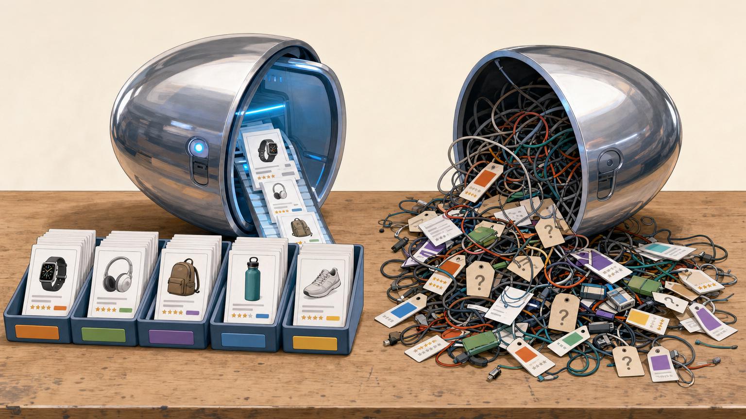

The dashboard glows green while revenue barely moves.
Monday’s report looks excellent: rankings up, impressions climbing, sessions breaking records. Yet retailer outbound clicks barely twitch. That mismatch feels like growth, but it is mostly borrowed attention—readers arrive, scan, and leave without trusting the page enough to choose.
The problem is not reach. It is that the roundup behaves like an information page when the visitor came for a decision. Traffic metrics celebrate visibility; click metrics expose whether the page reduces uncertainty. When clicks stay flat, the page is failing at selection, not discovery.
Some “best” searches are not shopping clicks
A large share of “best” queries looks commercial on the surface but behaves more like research. The searcher often wants a map of the category first: what matters, which models are comparable, what trade-offs exist, and whether the product type even fits the use case.
That changes the expected click pattern. Instead of jumping to a merchant, readers pause on:
- spec tables
- feature definitions
- use-case comparisons
- price-band explanations
- “X vs Y” follow-up searches
A query like best mirrorless camera can hide several very different jobs: beginner orientation, shortlist building, lens-ecosystem research, or budget planning. In that state, the roundup is often being used as a decision framework, not a handoff page.
The harder question
Sometimes the issue is not weak copy or button placement. Sometimes the wrong page was built for the keyword. If the dominant need is category education, a conventional roundup may be forcing a buying journey too early.
A better match may be:
- a buyer’s guide
- a comparison hub
- a spec explainer
- a use-case selector
When clicks stay low, the real diagnosis may be simple: the keyword did bring the right audience, but not the right stage of audience for a roundup.
Trust is the missing signal
When every product sounds excellent, the page stops sounding selective. Readers quickly detect the bias common in affiliate comparisons when flaws are softened, rankings feel interchangeable, and every option is framed as a safe buy. That tone can preserve traffic, but it rarely creates enough confidence to click.
Trust returns when judgment is visible:
- Named criteria matter more than vague praise.
- Tradeoffs make rankings believable: lower price may mean weaker support; premium build may be unnecessary for casual use.
- Clear losers prove the list has standards.
- “Not for” guidance helps readers rule products out, fast.
The strongest roundups do not just recommend; they disqualify. A reader clicks when the page reduces risk, not when it sounds politely enthusiastic about everything.
If every item receives approval, the page reads padded. One well-explained rejection often builds more trust than another positive blurb.
When every option looks equal
A roundup starts to fail when every entry is given the same weight. Ten similar cards, ten similar claims, and ten affiliate buttons force the reader to perform the ranking the page promised to do. That creates scanning fatigue: attention stays on the page, but action stalls.
A buried recommendation is almost no recommendation at all. If the strongest pick appears halfway down, after several nearly identical blurbs, the reader has already shifted into comparison mode. At that point, the page needs to narrow choices fast, not keep expanding them.
A stronger structure does three things near the top:
- Surface one primary pick immediately.
- Name 2–3 distinct alternatives by use case, budget, or constraint.
- Place a comparison table that speeds decisions right after the early picks, not near the end.
Each top option should carry a crisp decision aid: best for, not ideal for, and one decisive difference. That single line often does more than a full paragraph of generic praise. Readers are not looking for ten winners; they are looking for the first reasonable elimination.
The full list can still live below for depth and SEO breadth. But the top of the page should behave like a shortcut: reduce the field, clarify tradeoffs, and make the next click feel obvious.
Make the ranking do decision work
A roundup stops converting when the order feels ceremonial. If #1 through #7 all sound “great for most people,” the reader is left to do the hard part: judging risk. That is not a formatting flaw; it is a decision-confidence failure.
A stronger list creates a visible pecking order. Each placement should answer two questions fast: why this one wins and who should skip it. The click becomes easier because uncertainty shrinks.
- Top pick: best default for the largest share of buyers, with one clear winning trait.
- Upgrade pick: costs more, but earns the premium with a specific gain.
- Budget pick: acceptable compromises, named plainly.
- Not for: the buyer type likely to regret the choice.
The most persuasive rankings also make the gaps explicit. If the runner-up is nearly as good, say why it still loses. If a lower-ranked product beats the winner on one dimension, note that too. Clear tradeoffs make the ranking feel safer, not weaker.
Small friction, big losses
Interest alone does not create clicks. Once the ranking feels credible, micro-friction decides whether the next step feels effortless or oddly hard.
Common leaks appear in plain sight:
- Weak anchors: bland labels like “Check price” or “View product” give no real reason to leave the page.
- Late or sparse CTAs: one link buried after dense copy forces extra scrolling and a second decision.
- Poor mobile placement: sticky ads, wide tables, and tiny tap targets push action below the fold.
- Intent mismatch: a reader seeking proof responds better to “See test results” than to “Buy now.”
Each gap looks trivial on its own. Together, they create a stop-start experience: scan, hesitate, scroll, reconsider, abandon. Most roundups do not lose clicks through one dramatic flaw; they lose them through stacked friction.
For evaluation-stage readers, bridge CTAs often outperform hard-sell buttons:
See why it ranked first Compare price and sizes Read owner reviewsThe best prompt feels like a natural continuation of the decision process.
Audit the Page Before Touching the Copy
-
Verify click tracking first
Match outbound-click events against affiliate reports. A weak CTR can be a tagging error, not a content failure.
-
Split CTR by segment
Compare mobile vs. desktop, new vs. returning visitors, traffic source, and scroll depth. Blended averages hide where clicks actually break.
-
Separate intent pockets
Group queries and sections by research, comparison, and ready-to-buy intent. Low CTR from informational traffic means something different from low CTR on commercial terms.
-
Check for trust gaps
Look for vague ranking criteria, missing exclusions, soft disclosures, and no clear “best for” logic. Readers click less when the page feels unproven.
-
Inspect layout friction
Review CTA visibility, table readability, anchor jumps, and mobile spacing. Tiny interaction costs often suppress otherwise willing clicks.
Before any rewrite, confirm analytics can capture affiliate clicks in WordPress and that button, text, and table clicks are not double-counted.
Fix the roundup in this order
-
Tighten targeting
Split research intent from shopping intent. Keep roundups only where a recommendation is expected.
-
Surface one clear winner
Name the default pick early, then frame alternatives by use case.
-
Add proof and disqualifiers
Show evidence, tradeoffs, and who each product is not for.
-
Improve decision aids and CTAs
Place tables, badges, and action links exactly where hesitation appears.
-
Measure section-level impact
Track CTR from hero, table, and cards before and after each change.
A roundup earns clicks only when it removes uncertainty faster than the search results page. A flat list of acceptable options rarely does that.
The winning mindset is simple: treat the page as a decision engine, not a traffic asset. Fix audience fit first, then recommendation clarity, proof, decision support, and calls to action — and validate each section with data.











7 responses to “Why a Best Product Roundup Gets Traffic but No Clicks”
I wish more people talked about tracking before copy changes. I wasted 2 weeks “improving” a roundup when the real issue was that mobile CTA buttons were getting shoved way too far down the page.
Desktop looked fine, mobile was a graveyard. Section-level CTR told the story way faster than heatmaps did for me.
That’s a great example. When layout friction is device-specific, copy edits can look ineffective simply because the click opportunity isn’t being seen.
Checking segment-level CTR first usually saves a lot of random rewriting.
Interesting article, but I’m a little skeptical that “trust” is always the missing signal. Sometimes the products really *are* too similar, and no amount of “visible standards” changes that.
In my case the bigger lift came from adding side-by-side comparisons and trimming the list from 15 down to 6. Less credibility theater, more decision shortcut.
Fair pushback. Trust isn’t the only issue, and when the products cluster tightly, differentiation can matter more than persuasion.
I’d still count side-by-side comparisons and a shorter list as trust-adjacent, though, because they make the judgment process easier to verify rather than just asking the reader to accept the ranking.
I read it the same way. Not “trust solves everything,” more like readers need enough evidence to believe the list isn’t fluff. But yeah, if 15 options look the same, I’m out.
“Some best searches are not shopping clicks” should be tattooed on half the SEO industry 😂
I had a keyword that looked super commercial in Ahrefs, but visitors clearly wanted a beginner explainer first. Built a comparison hub instead of forcing the roundup to do everything, and engagement got way better. Revenue took longer, but at least the page stopped pretending.
I appreciated the part about each placement needing a winner reason *and* a skip reason.
A lot of roundups sound like they’re afraid to say anything negative, which makes the whole page feel fake. When I started adding “not ideal if…” blurbs, complaints actually went down because people self-selected better.