
A good affiliate button feels like the next sensible step, not a hand reaching for a wallet.
A detailed review can answer every obvious question, then lose momentum with a button that says “Buy Now.” For a reader still comparing options, that wording can feel premature; for someone who has already chosen, “Learn More” adds an unnecessary detour.
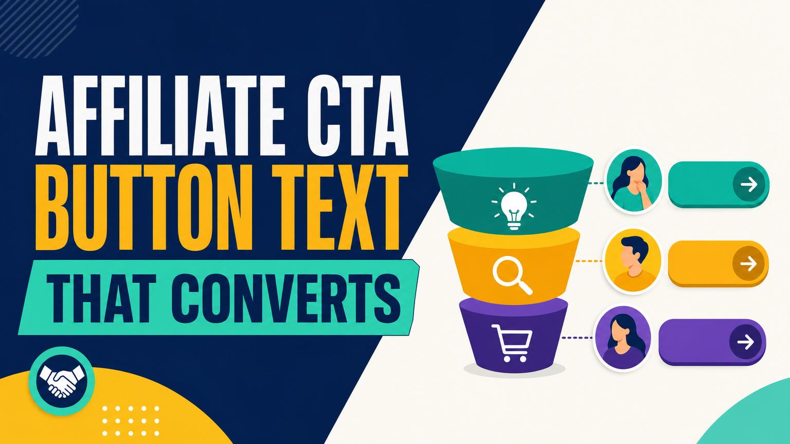
Button copy works best when it mirrors the reader’s current level of confidence. Early-stage visitors may want to see options, check a price range, or read a product page. Readers close to a decision often want to confirm availability, view the latest price, or complete the purchase. The button is not merely decoration at the end of a paragraph—it is a small promise about what happens next. When that promise matches the surrounding content and the reader’s intent, the click feels low-friction rather than pressured.
- Use the destination to keep the promise: “Check today’s price” should lead directly to a current product listing, not a broad category page.
Match the button to page intent
A CTA cannot be chosen well from a sitewide template alone. First, identify what the page is trying to help a reader do right now. Its title, main headings, and the words that brought visitors there usually reveal the stage quickly.
| If the page mainly… | It is likely… | Button language should lean toward… |
|---|---|---|
| Explains a problem or introduces options | Awareness | learning: “See how it works” |
| Compares features, types, or brands | Consideration | evaluating: “Compare models” |
| Reviews one product, lists prices, or answers “best for” questions | Decision | acting: “Check today’s price” |
Read the query language
Awareness pages often target searches such as “what is,” “how does,” or “ways to.” A button promising a purchase at this point can feel premature. Consideration pages commonly use “vs,” “alternatives,” “best type,” and other commercial-intent search terms; buttons can invite a comparison, a spec check, or a look at shortlisted products.
Decision pages carry the clearest action signals: a specific model name, “review,” “price,” “deal,” or “where to buy.” Here, a direct retailer-bound CTA is usually appropriate. When signals conflict, let the dominant heading and page purpose decide—not the keyword in isolation.
Build a CTA that tells the truth
A dependable affiliate CTA needs only two parts: an action verb plus the real next step or benefit. The wording should help readers predict the click, not decorate the button.
Formula: Verb + specific destination, task, or outcome
- Check today’s price — sends readers to a product or retailer page with current pricing.
- See sizes and colors — fits a merchant page where variants can be selected.
- Compare models at [Merchant] — works when the link opens a relevant comparison or category page.
- Read the full specifications — only when those details are available after the click.
For a merchant-bound button, accuracy matters more than cleverness. “Buy now” is appropriate only when the destination makes buying straightforward. A button labeled “View on Amazon” should open the relevant Amazon listing, rather than a generic storefront, a different retailer, or an unrelated roundup.
Use urgency sparingly
Urgency is not a default upgrade. “Shop before it’s gone” or “Get the deal now” can feel pushy when stock and promotions have not been checked. It also creates a promise the publisher may not control.
Use time-sensitive wording only when the offer is visible and verifiable at the destination, such as View the current coupon or See the sale price. Otherwise, plain language—Check availability or See current price—is more credible and usually easier to maintain.
Invite exploration before asking for a purchase
Early-stage readers are still deciding what matters. A button that says “Buy now” can feel out of place beside a beginner’s guide, comparison of product types, or “what is” article. At this point, the useful click is often one that lets the reader browse, learn, or see the range available.
Choose language that promises a small next step and names the destination honestly:
- Explore beginner camera kits
- See how trail shoes differ
- Browse budget-friendly options
- View the full color range
- Read product details
“Explore” and “browse” work well when the affiliate link opens a category page. “See” and “read” suit a product guide, specification page, or brand collection. The surrounding copy should make the benefit concrete: a reader researching coffee grinders may be more willing to click “Compare grinder styles” than a vague “Learn more.”
Avoid inventing certainty. Phrases such as “Find your perfect match” or “Get the best one” overpromise when the reader has not yet narrowed the field. A calm CTA preserves trust and keeps the article useful even for visitors who are only gathering ideas.
Help shoppers check the details that decide the purchase
Consideration-stage readers have a shorter list and more practical questions: Does it come in the right size? Is the price reasonable? Are owners satisfied? Button text can point directly to that proof, provided the merchant page actually contains it.
Match the verb to both the product category and the landing page:
| Reader needs | Appropriate button text | Best destination |
|---|---|---|
| Current cost | Check today’s price | Product or retailer page with a visible price |
| Fit or variants | See sizes and colors | Product page with selectable options |
| Technical fit | Check full specifications | Specification or manufacturer page |
| Social proof | Read verified customer reviews | Page that displays reviews |
| Side-by-side choice | Compare available models | Category or comparison page |
Specific wording reduces a disappointing click. For example, “Check sizes and colors” is misleading if the link leads only to a general shoe category; “Browse running shoes” is the accurate alternative. Likewise, do not use “Read reviews” for a merchant page where reviews are hidden, sparse, or unavailable.
When price varies by seller or selected option, “Check current price” is safer than quoting a figure in the button. The click then answers the shopper’s real question without implying a guarantee the page cannot keep.
Use retailer-specific buttons at decision time
A direct button such as “Check price at REI” or “View the KitchenAid mixer at Amazon” fits pages where the reader is close to acting: an individual review, a clearly ranked recommendation, or a deal page tied to a named merchant. The retailer name reduces uncertainty. It tells readers where the click goes before they leave the article.
The paragraph immediately above the button should do the persuasion; the button should simply finish it. For example: “This model is the quieter pick for small apartments, with a compact footprint and an easy-to-clean filter.” The natural next move is “See current price at Target,” not “Learn more.”
This handoff is especially useful when CTAs appear before readers move on from the page. A vague button after a specific recommendation forces an unnecessary extra decision. A named retailer and action keep the path continuous.
Retailer-specific language is less suitable on a comparison page with several equally viable sellers, or when the destination is a general product search. In those cases, “Compare retailers” or “See available options” is more honest than implying one preferred store.
Price, stock, shipping speed, coupon savings, and “lowest price” claims can change quickly. Confirm the exact product, retailer, region, and any membership conditions before publishing.
If a claim cannot be checked at that moment, use durable wording such as “Check current price” or “View today’s availability.”
Keep offer language tied to visible evidence
Deal pages can support stronger CTAs because the offer itself is the reason to click. When a sale is visible and its terms are clear, “Get the 20% off offer at Best Buy” connects the stated benefit to the next action. The discount should be real for the linked item—not a broad sitewide promotion that may exclude it.
A quick check prevents common mismatches:
- The button leads to the exact model, size, or variant discussed.
- The displayed price and discount match the destination page.
- Shipping wording reflects the actual threshold, location limits, or membership requirement.
- End dates and limited-stock language are removed when no longer confirmed.
When details are uncertain, the copy can still be useful without overreaching: “This retailer currently lists the model; check the page for live pricing and delivery options.” Follow it with “Check current price at Walmart.” The rationale remains in the sentence, while the CTA names one simple next action.
That division makes buttons easier to trust. The article explains why the product or offer may suit the reader; the button states where to verify it and continue.
Keep proof beside the button
A button works best when it contains one clear action, not every reason to trust the click. “Check price at REI” is easier to scan than “Check today’s REI price, free returns, and stock.”
Put supporting details immediately below or beside the button instead. This preserves a clean choice while answering the hesitation most likely to stop a click.
- Retailer: “Opens REI” or “View at Amazon”
- Affiliate disclosure: “Affiliate link; no extra cost”
- Availability or timing: “Stock and delivery dates shown at checkout”
- Returns: “See retailer return policy”
Only state facts that are visible on the destination or have been checked recently. If return terms, shipping, or stock cannot be confirmed, link to the relevant policy rather than making a broad promise.
Test by buying stage, not guesswork
A small, repeatable routine makes CTA changes easier to interpret. Start by classifying the page: an introductory guide, a comparison, a review, or a deal-focused page. Then open the affiliate destination and confirm that the button’s wording still describes what appears there.
Change one stage-specific element at a time. On an early guide, compare “Browse options” with “See popular models.” On a comparison page, test “Compare current prices” against “Check prices at retailers.” On a decision page, test a named-store button only when that store is the actual destination.
Track clicks, and where reporting permits, downstream orders or revenue. Keep the winning wording, placement, and reassurance pattern as a template for pages with the same intent. A winner on a beginner guide is not automatically a winner on a product review.
Make the Next Click Clear
- A button succeeds when its promise matches the page behind it.
- Small, controlled tests reveal which truthful wording best fits a page type.
The strongest affiliate CTA is not necessarily the most forceful one. It tells readers what they can do next, reflects how close they are to buying, and leads exactly where it says it will.
Keep the wording specific, check claims before publishing, and test one change at a time. Over time, those small checks make buttons more useful—and their results easier to trust.









26 responses to “How to Write Affiliate CTA Button Text for Each Buying Stage”
Step 3 didn’t work for me at first. I replaced “Check price” with “View the $89 offer,” but the merchant changed the price the next morning and I had to scramble to update several pages.
Now I only use the exact-price wording on a few high-traffic product pages where I can verify it regularly. For the rest, “See current price” is less exciting but much safer.
You made the right adjustment. Exact-price CTAs can be useful, but only where you have a dependable process for checking the item-specific price. A truthful general destination promise is better than a compelling claim that becomes stale.
Same headache here. I started using a small “price checked” note beside the button with a date, but only on pages I actively maintain.
Question: on a “best beginner options” article, would “See our top picks” be too vague? The page is early-stage, but I still want readers to reach the individual product reviews.
It can work if the next page truly presents your selected options. You could make it slightly more informative with something like “Explore beginner-friendly picks” or “See beginner picks and reviews.” That keeps the exploratory tone while signaling what comes next.
I’m still unsure how much copy belongs on the button itself. “Check availability, delivery date, and current price at Target” is accurate, but it’s a whole sentence.
Would you shorten that and put the delivery/price proof in the line above?
Yes, that is usually cleaner. Keep the button scannable—perhaps “Check current details at Target”—and place verified, item-specific information such as price, delivery estimate, or stock context immediately beside or above it. The button and nearby proof should work together rather than forcing all the detail into one label.
“Reserve urgency for verified, visible time-sensitive offers” should be printed on a poster. Fake countdown energy has gotten so cheesy that I actively avoid those buttons now.
Minor pushback: sometimes “Check price” is perfectly fine. Not every CTA needs to sound like it was written by a committee trying to win a marketing award. Clear beats clever, agreed—but simple can be clear too.
For an article targeting “best laptop for college,” I assumed the reader was ready to buy. But looking at the query, they may still be sorting battery life, weight, and budget.
I’m going to move my retailer links lower and put “Compare student-friendly models” near the top instead. This gives me a clearer structure than stuffing Buy buttons everywhere.
Exactly. That query often mixes consideration and decision intent, so the page can support both without treating every visitor as ready to purchase. Early comparison CTAs followed by retailer-specific options near shortlisted products is a sensible sequence.
Would you ever use “Read customer reviews” as the CTA if the affiliate destination lands on the product listing, not directly on the reviews tab? It technically has reviews, but it doesn’t open there.
I would avoid that exact wording unless the destination reliably opens at the reviews section or makes reviews immediately prominent. “See product details and customer reviews” may be more accurate for a general listing page, assuming both are available there.
This worked! I changed a comparison-page button from “Buy Now” to “Compare sizes and current prices” and people actually clicked it more. It feels obvious after reading this, but I was asking for the sale way too early.
That’s a great example of matching the click to consideration intent. “Compare sizes and current prices” makes a specific, believable promise, so the visitor knows what they will get before leaving the page.
I appreciate the reminder that the button has to tell the truth. “See today’s lowest price” is everywhere, but unless someone is checking every retailer constantly, that’s a pretty bold claim.
I was guilty of using “Learn More” on basically every button. 😅 After separating my guide pages from my product-review pages, I can see why that wording tells the reader almost nothing.
One concern: the article says to test one change at a time, but my old pages need a full cleanup. Is it okay to update the misleading buttons in bulk and then run proper tests on the main page templates?
Yes. Correcting inaccurate or misleading destination language is a content-quality fix, not necessarily a conversion experiment. You can update those in bulk, then use a controlled single-variable test on representative templates when deciding between two truthful, stage-matched alternatives.
That’s what I did. Bulk-fixed “Learn More,” then tested only the label on my comparison template. Much easier to tell what changed.
The bit about keeping proof beside the button is underrated. A naked “Shop at Amazon” button after a huge paragraph always looked a little sketchy to me.
I’ve been testing retailer-specific buttons on my review pages: “Check price at REI” versus generic “Check price.” The named version is winning, though I suspect part of it is just that readers recognize the store.
Do you keep separate buttons for two retailers, or does that create too much choice at the decision stage?
Two retailer buttons can be appropriate when both are genuinely useful options and the page is decision-ready. Make the distinction clear—such as shipping, return policy, availability, or membership benefits—and avoid adding a long row of nearly identical choices. The proof near each button should explain why that destination may matter.
Good practical article. The distinction between an exploration CTA and a decision CTA is more helpful than the usual “make it urgent!” advice.
This worked on my niche site, but only after I noticed the proof was too far away from the button. I had a paragraph explaining why a model fit small apartments, then three unrelated sections, then a “View at retailer” button.
I moved a short line about dimensions and noise level directly above it, and the click rate improved. Nothing dramatic, but enough to keep the layout. The article’s “proof beside the button” point is probably why.
That is a very useful observation. The visitor should not have to hunt for the reason behind the next click. A compact, relevant proof point near the CTA connects the recommendation, the destination, and the action.
Yes! I think people call this “reducing friction,” but really it’s just not making readers play hide-and-seek with the reason to click.